I have been participating in the Sketchbook Project for quite some time now and this is my 6th sketchbook for it. You can see all the previous ones I've done online here. The books go to the Brooklyn Art Library and from there they travel all over the United States and sometimes further afield. They can be borrowed just like books from any library and after their tours they return and become part of the permanent collection of the library. This one will be touring in 2015. When I signed up (and there is still plenty of time to do so yourself if you're so inclined. Just go here) I had to choose a theme and I went for History Book, just because history is something I'm always fascinated by. However there is no need to stick too closely to your theme and as you can tell from this one I veered off subject rather far.
This is the front of the sketchbook and it was made last. By that time I already knew what the rest of the sketchbook looked liked and the front reflects that content. I found the title of the book while leafing through a Sunday supplement of the paper and once again it so exactly resonated with the sketchbook that it was quite uncanny.
When I started work in the sketchbook I still kept my theme firmly in mind and I began by collaging vintage papers over all the spreads. The pages of this 5 x 7 Moleskine sketchbook that the project provides you with, are quite flimsy and don't stand up well to lots of mixed media work as I know from previous ones so I glued quite a few of the pages together to make a sturdier background, ending up with 7 spreads. After that I could add those vintage papers and then cover them in thinned down gesso. That gave a good background for the next step which involved painting with acrylic paints followed by some stencilling.
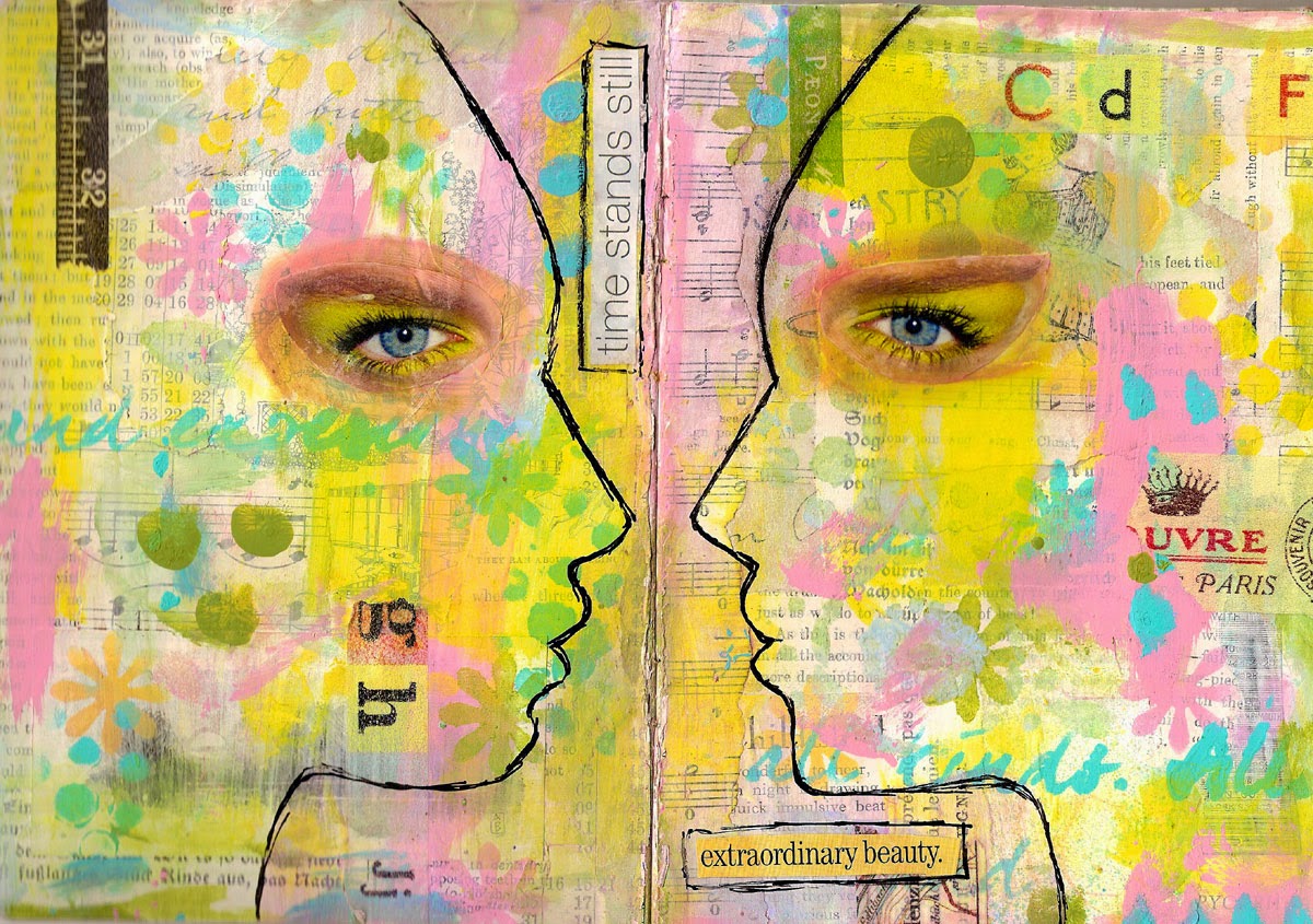
I seem to have developed an obsession with using eyes and these pages follow in the footsteps of previous work where I have used faces as masks. I found my faces in magazines (Vogue is specially good!) and painted around them with acrylic glaze which means you can still see a bit of the background, but it made the faces stand out beautifully. Then I looked for eyes (again Vogue has some great ones) and added them. The last step was to use markers and watercolour oil pastels to integrate the eyes into the backgrounds. Then the search for the texts began. These came from a wide variety of sources and they together with some strips of washi tape were the finishing touch to every page. In some of the texts I refer back somewhat to that history theme.
All the pages were done in the same way and you can see above that I used the same face as a mask on each spread with one of them mirrow imaged.
Even I found some of the finished pages a bit startling and for some reason the above one was the most unnerving, maybe because there are so many eyes as I've used the whole face rather than the silhouette.
After this front and 3 spreads you will be seeing the rest of the sketchbook in future posts. Only the image at the top is a photograph, all the rest are scans. There is quite a colour difference between the two, but I needed a picture to use as my blip for today!


1 comment:
fascinating pages Frieda-they really draw you in...
Post a Comment