Showing posts with label Alphabet ATCs. Show all posts

Wednesday, 8 June 2016

Opportunity

The prompt this week on the Colour Me Positive site was: Opportunity. The art challenge told us to use ribbon on our spread. I adapted several quotations into one which reads: "When opportunity comes knocking, you had better answer the door". 

The background was done with multiple layers of paint and just one stencil (the large one from the February 2015 Stencilgirl Club) To this I added the circular form from the April 2016 club. I also used rubber stamping (from the Rust & Dust set designed by Finnabair for Prima) as well as the text stamp that says:"There are things known and there are things unknown, and in between are the doors" (Jim Morrison). This comes from the Doors set by Darkroom Door.

I collaged on bits of a vintage bingo card as well as the person who comes knocking. you might recognize her as Red Riding Hood who perhaps found more opportunity than she bargained for when she came knocking. I found these doors (attached to a house) on the Houses stencil, also by Stencilgirl.

To answer the ribbon art challenge I added a bit of a flower garden to some of the houses with pieces of flower trim which were glued on with gel medium. A postage stamp with tulips helped to add colour to the garden too.

The quotation was written on by hand with a white marker and outlined with a pink gel pen.


Tuesday, 6 April 2010

Vintage Spring ATCs


These ATCs are the only sign of Spring visible at the moment and I've made them as spring like as I could in order to provide some sunshine in my life. The weather is still unwilling to come up with the goods as although the snow has mostly gone again, it remains very grey, cold, windy and wet.

The ATCs were made for the swap I'm hosting on the ATCsforAll site (there is still time to join us if you like!) and you will recognize the background as part of the same fabric-paper collage I used for the Spring Marie and the Alphastamps Spring ATCs.


On top of this background I sewed transparencies from one of my favourite collage sheets by Artchix Studio i.e. Spring Blossoms which features antique engravings of flower bulbs and insects as well as vintage text. I added the text from the same sheet but this time used the paper variety rather than the transparency. Finally I added green brads (flower shaped) and in 2 cases also a sparkly butterfly. The cards were finished by yellow zig-zag stitching around the edges. The one at the top is the one I decided to keep myself and I named that one S is for Spring. It will form part of my Alphabet ATCs. Not much progress has been made with that series and I think it was because I was doing them in alphabetical order and that meant I was pushing some cards where they did not want to go textwise. So now I'm doing them in random order and this one almost shouted out that it wanted to be the S card!

Thursday, 18 February 2010

Red and Black ATCs


The colour combination for the Colour Groupies this month was red and black, which I thought would be good to cover Valentine as well although sadly only Debby received it in time for the actual event. But Caryl and Lenna have now received theirs as well so I can post them here, still in the Valentine week.

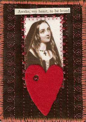
These ATCs are very much in fabric, rather than mixed media. In fact only the vintage text is paper, everything else is fabric. I used a black fabric, ironed onto Fast2Fuse and machine quilted it with a decorative (hearts!) machine stitch using red metallic thread. I added the fabric image (from Alpha Stamps Shakespeare's Heroines collage sheet) and stitched it on with red zigzag machine stitching and also added red size 11 seed beads by hand. The red hearts are felt and self adhesive. The vintage text was glued on and then black fabric was ironed onto the other side of the Fast2Fuse and the edges of the ATCs finished with red satin stitch.


I made one to keep as part of my Alphabet ATCs and of course this one is H is for Heart!

Thursday, 21 January 2010

Aqua and Royal Blue ATCs

Another year and another set of colour challenges for the Colour Groupies. Sadly we've lost Tristan but Lenna, Debby, Caryl and I have decided to continue with our monthly swaps, based on a different colour combination each month. I'm so happy as the ATCs produced by my fellow Groupies are simply gorgeous.

The colour combination for this month was chosen by Lenna who always seems to come up with the most fantastic names as well as colour combos.

The background is a royal blue fabric (although not much of it can be seen after all my decorations) which I machine quilted after layering it with Fast2Fuse. I added fabric images from Alpha Stamps Mermaids sheets #2 and #3 featuring beautiful ladies of the sea. I then added seaweed in the shape of a very textured fancy yarn and I also added transparent shell sequins. Vintage quotations were the finishing touch together with zigzag stitching around all the edges of the card.
And you might have thought I had forgotten about my Alphabet ATC project (okay, yes, I did for a while) but I'm back on track now and the one I made for myself to keep is of course called M is for Mermaid and the image is from Alpha Stamps Mermaids #3 sheet. You can see it above.

Monday, 14 September 2009

Lemon and Lime ATCs


The Colour Groupies (Caryl, Debby, Lenna and Tristan) were ready for our latest colour combination for September. This combo was chosen by Lenna and it's a really sunny as well as tasty one. By good fortune I had found just the right fabric, not at our most recent Area Day of the Quilters' Guild in Scotland but at our one before that in Perth. Can you believe I really found a fabric featuring both lemon and limes (okay, so orange also featured on this fabric too, but by carefully cutting I managed to leave them out!).

I made a stripy background using lemon and lime coloured fabrics and then fuzzy cut both lemons and limes from the above mentioned fabric. These were machine stitched onto the background that was layered with Fast2Fuse. As lemon as well as limes make most people look a bit sour to say the least, I looked for images with suitable expressions and I found these women on a transparency sheet by Divasdeste. They were stitched on as shown and I then suddenly thought to make the Lemon and Lime theme into a question by changing and to or. The text was printed on my trusty Dymo writer. I added tiny little buttons in the appropriate colours, added a backing fabric and satin stitched the edges in yellow.
Of course I made one for me to keep too and as part of my Alphabet ATC project this one is L is for Lemon or Lime of course!

Friday, 28 August 2009

F is for Farewell


I mentioned in one of my earlier posts that the last Alphastamps Design Kit contained several ghoulish but gorgeous images, just to my taste. And I used one of them to make this ATC which is also one in my series of Alphabet ATCs.

F is for Farewell is very suitable for today as it's farewell to summer by the end of August here in Scotland; it's also farewell to yet another year of my life (where did they all disappear to??)and of course very soon it will be farewell to work for John. And F is also for Frieda, naturally.

Hopefully we won't both be looking like the skeleton on the card anytime in the near future!

You will recognize the black-white fabric-paper collaged background from the Royal Bird ATCs posted earlier. It included vintage images in the collage of which the initial and the bird are examples. I added the image from Alphastamps Death Cards collage sheet. The gold leaves are also available from Alphastamps. The edges were finished with black satin stitching (which seemed appropriate for such a funereal figure) and small gold delicas were stitched on.

Wednesday, 12 August 2009

Wine and Olive ATCs


It's that time of the month again, my Colour Groupies ATCs for August have all landed with Tristan, Lenna, Debby and Caryl and I can reveal them here too. The combinations this year feature a lot of food inspired colours and August was no exception. Wine and Olives, yum, yum!

I was looking through my left-overs from fabric/paper collages and found just the right colours and amazingly the collage in question also featured wine glasses and bottles as well as wine labels. I made the collage originally for the September Journal Quilt in 2007 (no, I never throw anything out, the thought alone makes me shudder!!)

So I cut this background to ATC size and layered it up with felt. I then started looking for transparencies to go with this background and when I came across the Temperance one and the Hand (both from Bmuse) I felt they were a great match. The text In Vino Veritas (Truth in Wine) was not far behind and came to me in one wonderful lightbulb moment. It was added with a Dymo writer. The transparencies were stitched on and the edges of the ATC were zigzag stitched in wine coloured thread.

As usual I made one for myself to keep as part of my Alphabet ATC and this one is I for In Vino Veritas. I have missed out some letters but don't worry, I will get around to them in the near future!

Monday, 13 July 2009

Red and Blue ATCs


This month the colour combination for our Colour Groupies group was Red and Blue, partly in honour of Independence Day in the US.

All my cards have arrived safely now with Tristan, Lenna, Debby and Caryl so I can also reveal them here.
I started with a red fabric background which was ironed onto Fast2Fuse and then free machine quilted with blue thread. I added blue clouds, cut from another fabric and machine stitched on. I've used a variety of different but very similar images on the cards. They all come from the collage sheet All in Red from Altered by Design. I also added vintage text to some of the cards.

Tristan had send me a lovely collection of red, silver and blue sparkly stars with his cards and I added one of each to my cards this month too. Just the thing, thanks Tristan!

A blue fabric (the same as used for the clouds) was ironed onto the other side of the Fast2Fuse and the cards were finished with blue satin stitching around the edges.

I also made one for me to keep as part of my Alphabet ATC project. This one is called: E is for Eternal.

Tuesday, 9 June 2009

Forest and Rust ATCs

Our monthly theme at Colour Groupies this month is not food related for a change and is a much more sombre combination than we usually have. I used a piece of habutai silk which I had hand-dyed and used as a experiment in using twin needles on my machine. It had been lingering in a box but once I got it out, proved to be ideal for the forest and rust colour combination. I layered the ATCs with felt and then thought about the images I wanted to add.

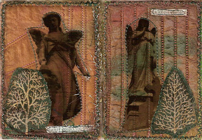
Graveyards are very often beautiful places with decay and greenery making for a peaceful and thought provoking environment (I often go and visit old ones, of which we have many here in the Scottish Borders) so in the end I used transparencies (from Collage Stuff) of ancient gravestone angels and children. I also sewed on a tree from a commercial fabric to stay in theme.
The cards were finished with a fluffy gold couched yarn.

All the cards have landed safely with Tristan, Lenna, Debby and Caryl so I can reveal them here together with the extra ATC I made to keep myself in my new series of Alphabet ATCs and of course in this case D is for Darkness

Thursday, 14 May 2009

Chocolate and Red ATCs

All the Colour Groupies ATCs have landed safely at their respective destination with Lenna, Tristan, Debby and Caryl, so I can reveal them here too.

We had a very tasty colour combination this month and I decided to get not just the colour of chocolate but the actual detectable stuff itself onto the ATCs.

I started with a brown + red fabric which I bought specially for this swap at our Regional Quilters' Guild Area day in Perth recently. This was ironed onto Fast2Fuse and I then remembered I did have a fabric in my stash featuring roses, hearts,postcards and boxes of chocolate so these images were in my mind when I started to look for a female image to go with it all. Sorry to sound so sexist but in my experience we are simply a lot more into chocolate than our male counterparts.
I found the beautiful images on Alphastamps Caroline Otero fabric sheet and used a different one on every card. The roses/chocolate/postcard images were then added to the mix (both by stitching). Alphastamps also provided the delectable Chocolate text brown ribbon which was added to some of the cards. The same original background fabric was ironed onto the other side of the Fast2Fuse and the edges of the ATCs finished with brown satin stitching and red size 11 seed beads.

Finally I made one for myself in my new Alphabet ATC project as of course C is for Chocolate! She also received some seed beads for her necklace as well as for her earrings (also to be found in some of the other cards)

Thursday, 9 April 2009

Peach and Cream ATCs

The colour scheme for this month's Colour Groupies ATC swap is Peach and Cream. I made these ATCs some time ago but they have now been received safely by all the Colour Groupies (Lenna, Debby, Caryl and Tristan) so I can upload them here as well. We like to keep them a surprise!! Such fun when the envelopes come in from everyone else and so amazing that we all do such different things with the same colour combos.

This month there is a suitable sunny combination to bring a little ray of light to us all as the weather does not seem to want to co-operate much in bringing us Spring.

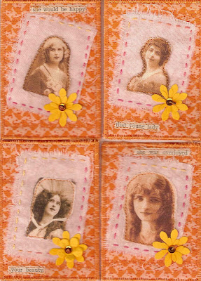
I used a peachy fabric, which was layered onto Fast2Fuse and machine quilted with a decorative machine stitch. I used the pattern of a tulip and peachy thread. Onto this I layered a creamy fabric and a fabric image from my collection of vintage postcards. The creamy fabric was hand stitched down with a variegated thread. I added vintage text to all and also paper flower shapes punched out of peach paper. They are held down with a sew-on Swarovksi crystal and a size 11 seed beed, both also in peach.

Finally I ironed the same peach fabric onto the back and finished the edges with satin stitching.


I also made a very similar one for my Alphabet ATC project with the title: B is for Beautiful.

Sunday, 1 March 2009

A is for Antoinette

Ever since I made the decision to not accept any more bookings for talks and workshops in order to have more time for my own work and also to spend some time just "playing", the workshops and talks that I have done, in both Northern and Southern Ireland and yesterday in Hamilton, were so lovely that I was tempted to change my mind!! But no, I know I need more time to concentrate on my large quilts and simply to give myself thinking time so I will have to train myself to say no. Rather ironic then, that I'm reading a self-help book (see the side bar on the right) which is urging us to say Yes, but in a sense saying no means saying yes in my case. Yes to more me-time!!

After seeing everyone stitching away merrily in Hamilton, my fingers were literally itching to do the same when I arrived home and today I indulged by making my ATCs for the Rosey Marie swap on the site I recently joined dedicated to Marie Antoinette as well as making an ATC for a new project I have started: Alphabet ATCs. Yes, indeed that means I've finished my 100 ATC project and I'll show you no. 100 in the very near future!

Marie Antoinette has very romantic connotations for many people, myself included, despite her tragic end, and of course, she herself was a romantic par excellence. In this swap we were asked to combine her with roses, which proved an irrssistable attraction to me, so today I spend some happy hours making a fabric collage on Fast2Fuse, using a variety of rose fabrics. I added different Marie Antoinette images which I had printed on self-adhesive cotton sheets (from Crafty Computer Paper), adding hand and machine stitching and covering the entire ATCs with French writing transparencies. The cards were finished by ironing another rose fabric to the back of the ATCs, adding pink zig-zag stitching around the edges and finally adding size 11 seed beads by hand.
The first card for my Alphabet ATCs is also dedicated to Marie and is called A is for Antoinette. It was made in the same way as described above with the addition of a transparent A (from Altered Pages). I'll be adding the actual letters to every Alphabet ATC I make.

LinkWithin

Related Posts with Thumbnails