Showing posts with label sketchbook challenge. Show all posts

Tuesday, 16 December 2014

Tributo alla Serenissima Journal Quilt

All Good Things was the December challenge on the Sketchbook Challenge site. We all know how that saying goes: "must come to an end", and I don't want to imply in any way that Venice is about to go under. Lots of money and advanced technology means that such a catastrophe isn't about to happen. What will however finish is the Challenge itself. This will be the very last one and no more themes will be set in 2015 although the blog site will remain available and if you want to start from scratch you can go back to January 2011 and work on all the themes in your own time.

This also means that I will no longer make these monthly 10" square journal quilts after having followed all the prompts religiously for 4 years. And I did feel a sense of relief. Had they continued with themes then so would I. I'm made that way. Once I start a challenge I carry on even when my heart is no longer completely in it. These challenge JQs have produced some of my best work and although some of them were sold during the 52 Journals exhibition, looking at all of them together as I have just done shows the progression of my art over those 4 years as well as the much wider range of techniques I now use compared to a few years ago.
Because it was the last one I took the liberty of forgetting the ending of that All Good Things saying and took just the words as they stood. Nothing more good, or even best than Venice and when I made my mixed media page for the imagined holiday on The Documented Life Project last week I also made the background for this journal quilt which is another of my Venice inspired art. No idea how many Venice related pieces I have made over the years but a lot! And no doubt more will appear in future.

I made the background using calico (muslin in US), my gelli plate and a variety of stencils from StencilGirl. You saw that piece of fabric on an earlier post. Then I used the Carolyn Dube designed large Venice stencil (also from Stencilgirl) and added the outline of those iconic Venetian buildings. I hand stitched along the outline of them. and then added the inches which were leftovers from a previous project and embellished them.
I felt that necessitated something in the left corner area to balance those inchies and thought about a cloud floating by. A fragment of text came to mind and you can see above that I handstitched it on and covered it with Diamond Glaze to make it a bit more sturdy. Little blue star embellishments were added to the sky.
Larger blue embellishments were glued on as seen above. I never fully trust any sort of glue so stitching was also added to hold them in place. For some reason I couldn't make up my mind about the binding and the white one you see is the third one I tried (yes, I stitched the previous ones on and then undid them!). I'm still not fully happy with it but sometimes you have to accept that the perfect binding can't be found, at least not here in my stash.

I haven't decided yet whether or not to continue with  the other series of  journal quilts I have been making monthly for the Contemporary Quilt Group. It will depend on the size and the guidelines they set which won't be revealed till January so I'm keeping my options open. I will have been making journal quilts since 2004 so for 11 years non-stop. Perhaps it's time to draw a line but they have contributed greatly to the development of my art so maybe just one more year of making just one a month! Will keep you up to date as soon as that decision has been made.

It's very unlike me to make so many decisions for the coming new year. It feels like time to take stock this year and decide what I want to do most with my time considering that there is only so much that can be cramped into any one day. If you have been checking out the side bar you will know I have joined some new classes and projects about which more in future. More and more mixed media work seems to creep in so it seemed a good investment to learn more about the techniques used. I'm probably (in fact, definitely!) biting off more than I can manage to chew but I do love a challenge! Nothing learned is ever a waste, has been a life long motto.

Wednesday, 12 November 2014

Every Leaf is a Flower Journal Quilt

Does this look familiar to you? If so, well spotted. I'm plagiarizing my own work here to make my November Journal Quilt for the Sketchbook Challenge site. I have to also admit that I was a bit disappointed with the theme there this month which was: Autumn Leaves. Nothing wrong with it as such but the theme last month was Trees and I could as easily have used last month's journal quilt for this month. I would have loved something completely different. But as that wasn't to be I did my best to make this one as different from last month's as was possible and to do so I reached for my planner and found the Leaf Page I made for The Documented Life Project 2 weeks ago when the theme was Add Leaves. You can see that page underneath and also by following this link.
The page in my planner was done entirely in paper so my task was to translate that into fabric. I started with a piece of drop cloth (which I blogged earlier here). I then used the same Stencilgirl leaf stencil as I did for the Leaf Page and used it with the same colours of paint: red, orange and pink.  I then layered the resulting piece of fabric with wadding and backing fabric and outlined stitched the leaves with a variegated thread in those same colours.

I then filled in the background with running stitch in another variegated thread to tone in with that as you can see above. I also wanted to use postage stamps as in the original page, so made sure to leave some space for them. I used 3 French stamps with the same image but different colours and sealed them with several layers of matte medium.

I was asked about the postage stamps I had added to some of my 52 Journals a lot during the exhibition and most of those were sealed with acrylic wax (available from Art Van Go) but that does add a bit of a shine to the surface. In this case I didn't want to make the stamps the focus of the page so by using matte medium they fade more into the background.
What I liked most about the Leaf Page were the white dots I added using a marker pen. And of course there was an easy way to transfer that idea onto my journal quilt which was to use size 11 white seed beads as you can see above. The binding is a matching commercial batik fabric and of course I couldn't resist adding some red/orange seed beads along side that too.

So here it is. A fabric interpretation of one of my Documented Life pages. It's one of the reasons why I take on such projects which are non-fabric related. Doing the weekly pages sometimes produces work that is worthy of being made into a piece of fabric art. The pages become sort of an inspirational sketchbook that I can go to for inspiration when I need it as I did this week. Sometimes I veer away from the original page in my fabric interpretation but in this case I stuck pretty close to the original. This is also sort of an answer to another question I was asked frequently during the 52 Journals exhibition: where do I get my inspiration from? And as I said then to many visitors: there is really no greater pleasure than making something that is totally original to you. 

Finally I just discovered that this is my 2000th blog post. I started back in December 2006 and now here we all are in November 2014. I know some of you have been here right from the start and you deserve a medal for sticking with it all these years. Some of you on the other hand, have only recently landed here and a very big Welcome to you. So happy you're here. I have no intention at all of stopping. I'm enjoying this as much as you hopefully are, so onwards and forwards!

Thursday, 11 September 2014

Touch the Dream Journal Quilt


If this looks familiar. it's because I have used this imagery before. It was my page for The Documented Life Project last week and you can read about it on a previous blogpost here. It feels a bit like cheating to use it again but hey, it's my own art so I can. The reason I went ahead with it is that I have very little spare time at the moment and even less opportunity for quiet thinking which is necessary to come up with new ideas. So when I read that the September theme on the Sketchbook Challenge site was: Words, and I looked down at my planner what I saw there were words on the page I made. It felt like it was meant to be. 
I made it very much like the Documented Life page but instead of paper used fabric. For the background instead of plain white I went for white fabric with silver stars which I love because it looks like a starry sky behind the trees. I used the same rubber stamps as for the page i.e. the trees, the birds and the text come from Lavinia Stamps and the Frida Kahlo image from Invoke. The trees and birds were stamped straight onto the background using a fabric stamping pad. The text and Frida were stamped onto white fabric and then adhered to the quilt after I had hand quilted the tree outlines. I stitched them on using hand done buttonhole stitch.
And then I had the opportunity to do something I hadn't done on the paper version which was to add beading and embellishment as you can see on the detail above. Three of the trees have acquired red berries. I don't really know what this symbolizes but I felt the piece needed it. I'm quite pleased the Words theme made me transfer my idea from paper into fabric as even when I was making the paper page I felt the design would maybe work even better in fabric.

Thursday, 14 August 2014

My Day in Cups of Tea Journal Quilt

Back from their No Theme July the Sketchbook Challenge team's August challenge is: Tea and Coffee. I will admit that at first I wasn't very inspired by this despite the fact that I do love to drink both. My coffee intake is restricted to a double espresso in the morning to kick start the system and after that it's tea all the way. The first thing I thought to do was to dye some fabrics such as calico (muslin in US speak) and lace in very strong instant coffee and I ended up using the calico for the background of the piece. But nothing else came to mind till I browsed through the most recent issue of The Simple Things magazines.

There I found a page called My Day in Cups of Tea with accompanying pictures featuring someone's day and an interview with her. I just about managed to prevent myself shouting YES!. Not only was this a great idea but it would also provide me with the opportunity to practise staging some photographs and even more enjoyable, hunt for the many teacups hiding in various cupboards. Here are some of the pictures I took.
I think I bought this fruity teapot and cup way back when I lived in Largs. The lace came from my vintage stash and the piece of fabric was just hanging around in the studio and fitted the colour scheme. You will notice that some of the pictures have books in the background. It proved to be hard to avoid having them in the photographs as there are books here everywhere you look.
This is the picture I loved most out of all the ones I took. Not only do I love these kitty teacups (designed by Rosina Wachtmeister) but it's sitting on my favourite book from this summer and in the background is a silk cushion which was the very first piece of silk painting and quilting I ever did back in the summer of 1989. Note that even then I was a "circle lady".
The cup above is part of a French hand painted set which was acquired from a shop in Bath just before we moved to Scotland. In an impulse when looking for new curtains. I spied this in the shop window, went in and bought the entire service and used my old curtains in our new home instead. A decision which I never regretted! The biscuit is for purely decorative purposes!

The other two cups came from my collection too. The one at top left is hand painted too and given to me by a neighbour while the cup at bottom right came from my mother in law and is even older. It has no markings to tell where it was made. I don't use these cups as they are too precious but it was a joy to photograph them for this occasion.

As you can see the journal quilt is quite simple really, a bit like a scrapbook page. I added the time to the pictures using Photoshop Elements and printed them out onto inkjet canvas sticker sheet (from Crafty Computer Paper). They were then layered onto white felt to make them look more like old fashioned photographs. Then they were arranged onto the machine quilted, coffee dyed background and stitched down and beaded.
I borrowed the title from the magazine article too and treated it in the same way as the photographs. Finally I wanted the background to look a bit like a tablecloth and finished the edges with vintage lace stitched down and beaded.

Now I'm off to enjoy a cup of tea. Looking at all those teacups has made me thirsty!

Saturday, 12 July 2014

The Summer Sweet Journal Quilt

Despite the fabulous weather some things did get done and one of those was the journal quilt for July on the theme set by the Sketchbook Challenge. Sadly though the theme for this month was: No Theme. I say sad because I rely on the Sketchbook Challenge to, well, challenge me and without a theme that was a bit of a problem. The organizers are on holiday so I decided to follow suit and dedicate this month's journal quilt to summer.
 
I have just finished and send off a small quilt for the British - Finnish Stash Exchange where we are using fabrics send to us by Finnish quilters (and vice-versa). It's called Moon Flowers and I will show it here when the Festival of Quilts in Birmingham is on at the beginning of August, where it will be on show. On that piece I used flowers made on the pattern of my own doodles. The pattern was still hanging around on my desk and I grabbed it back again and used it for the flower on this piece.
 

The background idea too I've used before. I used a background of calico (muslin if you're in the US), layered it with wadding (batting) and a backing fabric, and appliquéd on many different laces. These were then machine quilted and I painted over the surface with white emulsion paint. I then sprayed this background with a leaf stencil (from Stencilgirl Products). I added the appliquéd flower and embellished it to my heart's content.

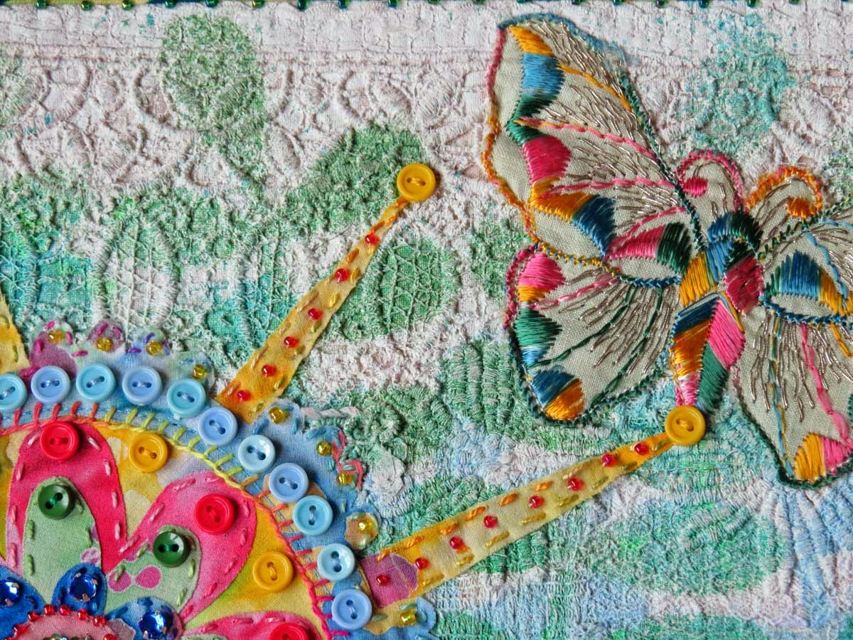
The right hand side of the quilt (10" square) still looked a bit empty so I went hunting through my stash and found these vintage butterfly appliqués (hand stitched, no less!). I'm not 100% sure where they came from but they proved to be just what was needed for this journal quilt. They were stitched on by machine and finally I added the vintage quotation from Shakespeare. It's only a partial one as I somehow got glue on part of it and it stuck to itself so I lost some words (the actual text being: The summers flower is to the summer sweet though to itself it only live and die) but I liked what was left even better than what I had originally. It now reads: "to the summer sweet, live and die", which seemed very suitable for butterflies. How I love such happy accidents.


Friday, 13 June 2014

Compass Journal Quilt

The July theme on the Sketchbook Challenge site is: Water. This led me to a train of thought which went something like this: water, ocean, being on a VLCC (very large crude carrier) with John when we were first married (he was in the Merchant Navy), navigation, compass. There were the beginnings of a GPS system on board but most navigation was still done with a compass and on a chart (this was the early 80s). I became quite adept at figuring it all out. Needless to say this is now a skill which is no longer necessary except in emergencies.

I knew that I had a compass stencil and I also wanted to capture the movement of water in the background so I set to work with my gelli plate, acrylic paints in watery colours and that compass stencil in addition to wave shaped masks I cut myself. I made a variety of painted fabrics in this way.
I then cut circles out of one of the fabrics using my Brother Scan'nCut machine and layered it up with others so that different fabrics were visible through the cut circles. I had a vague idea of having heard a compass quotation at some time or other and thanks to Google it didn't take me long to track it down. It's from Shakespeare's Julius Ceasar and reads: "This day I breathed first: time is come round, And where I did begin, there shall I end; My life is run his compass". I added part of it to the piece by printing it on calico (muslin in US speak).  Surprisingly this is closely connected in substance to my blog post from yesterday despite the fact that I finished the journal quilt on the 9th June. Uncanny how such things happen.
To capture the movement of water I added lots of hand stitching in circular movements which I did very peacefully over the past sunny days while sitting outside. I left the inside of the circles alone which meant they sort of puffed up, so this journal quilt is quite three dimensional.
Beading was the last step as per usual.

Thursday, 22 May 2014

The Sun is Shining Journal Quilt

The text on this Journal Quilt reads: "Somewhere the sun is shining". That may well be true, but it's not shining here in Macbiehill at the moment. It was quite a shock to the system after yesterday's lovely, warm and sunny day to be greeted by a cold wind and rain this morning. So perhaps this is a good day to upload this sunny piece that was inspired by the monthly theme on the Sketchbook Challenge site. It was The Colour Yellow.  
Hurray, yellow is my favourite colour and I love the sun, so I combined both elements into this 10" quilt. I started with yellow habotai silk which I stamped with a collection of my favourite stamps, using blue Staz-On ink. I then selected a sunray stencil (from Heidi Swapp) which I had used previously to make one of my Documented Life planner pages (see this previous post).  I used the stencil to mark out the rays on the blue Dupion silk fabric using Bondaweb, cut out the rays and applied the blue on top of the yellow fabric.
Hand stitching and beading was added to the blue rays and yellow seed stitching to the yellow ones as you can see on the detail above. Finally I added the yellow button and beaded around it, and the vintage text was added last.

Just looking at it on this dismal day makes me feel just that little bit warmer.

Thursday, 10 April 2014

Polka Dots Journal Quilt

The April theme on the Sketchbook Challenge site is: Polka Dots. Hurrah! I have a huge collection of polka dot themed fabrics (used to make a very large quilt from years back) so I grabbed them for starters. I then simply put Polka Dots into my search engine and the quotation: " Polka Dots are a way to Infinity" rolled out. It comes from the Japanese artist and writer Yayoi Kusama who shares my love for all things circular and dotty. It was the words themselves I wanted to use and I have recently acquired the perfect tool to do so, the Brother Scan'nCut. This machine cuts Bondawebbed fabric perfectly and I used the in-built alphabets to produce the letters from all my different polka dot fabrics.


A black dotty fabric was used for the background and machine quilted in a grid patterns which was then used to position the letters where I wanted them.

The final dotty addition were the size 11 seed beads sewn along the yellow dotted binding fabric and the flower buttons sprinkled over the piece. I'm quite taken with my ode to dottiness.

Friday, 14 March 2014

You Leave Me Cold Journal Quilt

It's been an eventful few days that I could have easily done without, specially as no work was done, which in my book counts as days wasted. But normality has returned and it 's beyond time to share the journal quilt I made for the March theme on the Sketchbook Challenge site which was: Warm and Cool. As luck would have it I was giving a talk shortly after the theme was announced to the Tweeddale Quilters and as I was talking about one of my previous Journal Quilts, called Highly Prized, and made in January 2011 I had a good look at it myself too and decided that I was rather taken by the technique of making a background with snippets of fabric on a background, using Mistyfuse. So the decision was made to use it again (at least it's legal to plagiarize your own work!). I divided the piece (10" square) in half and one side became cold and the other warm. 


Still in the spirit of borrowing inspiration from myself I thought back about a page I made in my own sketchbook not too long ago (you can see it here) using silhouetting. That too I had rather enjoyed so why not do that again too! I used black fabric and Bondaweb (WonderUnder in US speak) and applied the two silhouettes facing away from each other. I adorned them with hand stitiching and gave them each a necklace in their warm and cool colours respectively. And of course they needed warm and cool eyes too.  

These were found in magazine advertisements and scanned into the computer and then printed out onto fabric, adhered with Bondaweb and beaded. While working on the piece the title suddenly popped into my head (as often happens): "You leave me cold". I could of course also have gone for: "You're a hottie" but I liked the cold version better. 

Friday, 14 February 2014

An Inner Centre Journal Quilt

The February theme on the Sketchbook Challenge site is: Windows. I started thinking about it and had the idea for a design in my head when the  10" square quilt itself took charge and told me how it wanted to be made. It's one of the miracles of the creative process that things come out of your hands seemingly without your control or will. It's not the case in everything I make. Some of my work is very thought out (maybe too much so!) but in other cases I start with something and some unknown force takes over and leads me along the way it wants me to go. That's what happened in this case.

My first and only intended step was finding a fabric that looked like bricks. I searched among my stack of gelli plate printed fabrics and found one that looked promising. It even had a lighter area at the bottom which could become (I thought!) a flower garden. The search for the fabric took place in my indoors painting studio (otherwise known as the spare room) and while rummaging I came across a stencil I had been using while playing with the gelli plate. It was the Church Windows one from Stencilgirl Products.

Hang on a minute. What would happen if I used white acrylic paint through that stencil onto that brick like looking background. No thinking, just doing. I loved what I saw when I removed the stencil. Now I had lines I could hand quilt using white thread. But my piece wanted more such as a bit of a focal point.

More searching, this time through my stash, and I found a transparent ribbon (from a box of chocolates) featuring sparkling trees. Sadly I only had two trees and two is not a good number for compositional purposes. Not to worry, I could make a third tree out of gold lame.

Then I discovered some tin ivy which was couched around the side of one of the windows and further adorned with gold and green metallic rub-on.
Clearly this was a winter's night and stars would be shining. They were provided courtesy of another ribbon.
And a quick browse through a vintage book brought me the text: "There is an outer world, and there is an inner centre".  Oh yes!!!
I've tried to give you a bit of an insight into the process that happened when this quilt came to be but the truth is that I don't have any answers how this evolves. I simply know it does when somehow I am in that creative frame of mind (call it the zone if you want to use a cliché!). It's an experience I wish on everyone! It comes from my Inner Centre so what else could the quilt be called?!

Thursday, 16 January 2014

We dream We know Journal Quilt

I said you would see this gate again and here it is in it's final appearance. I told you last year that I would continue with the Sketchbook Challenge themed 10" square journal quilts and this is the first one. The January theme was: Sketch with Collage. I knew I wanted to include the gate so I started thinking how I could combine the two elements.
I started by grabbing the box that has all the left over fabrics from various other projects where I had printed my own or vintage images on fabric. They included text, maps, and photographs and I used MistyFuse to add them onto a background which I then layered up with wadding (batting) and a backing fabric and machine quilted this in a grid pattern as you can see above.
To unite all those disparate images I added a layer of thinned down gesso which faded the piece in a very pleasing manner. When adding gesso or paint to an already quilted piece it's always a bit of a gamble to see what will happen and it's not always what you were looking for but in this case it turned out better than I had expected. The next step was to spray this background with fabric paint using various leaf themed stencils. One of the paints I used was a metallic one.
The gate, sun ring and text were all printed onto inkjet prepared canvas sheets, cut out and then added to the journal quilt using my Xyron glue machine loaded up with a fabric glue cartridge. This is great for good adherence although I have to admit I still don't trust it and always make sure such pieces are also stitched down. Here I have used both hand and machine stitching. I discovered in my box of left-overs a strip of couched fabric and yarn which proved to be just what was needed to add some texture at the bottom of the gate. If I ever wonder why I never throw anything out this is the answer! Such items will always come in handy one day!
I added more hand stitching in the shape of little cross stitches and of course added beading to both the ring, and the title as well as around the binding which was made using part of a drop cloth (the cloth with which I mopped up all my painting and gelli plate printing).

The title comes from the poem I posted here on the 1st January, which was also the first time you saw that gate.

Friday, 20 December 2013

Wish Journal Quilt

As I told you in a previous post the theme for the Sketchbook Challenge this month was Holiday Colours and I made the Stars Journal show in that post. For that quilt I used the negative space after the tree had been cut out from the gelli plate printed black fabric. That left me with a black tree and it seemed a shame to waste it. So I decided to make another 10" square quilt this time making it a bit more christmassy. For this one I appliqued (using Bondaweb) the black tree onto a background of fabric also painted using the gelli plate. The tree was then hand stitched like the background on the Stars quilt but the background on this one was free machine stitched. 
To give a nostalgic feeling of wonder I added a fabric image as seen above (from Artchix Studio) by appliquéing it using the sewing machine.
The tree itself was decorated with silver ornaments in the shape of sequins. They only look different colours here as the flare of the camera flash picked up the holographic nature of the sequins. A blue star was put on top and then the word Wish (also from Artchix Studio) was stitched on in the top right hand corner. I know it's hard to see on the pictures but the round circular shape in the background right behind the tree is the moon and I have stuffed (trapunto like) it with extra wadding so it stands out slightly from the background. Of course beads were added along the perimeter of the binding. That has become more or less my signature for all my journal quilts.
Here is a view of both journal quilts so that you can appreciate the connection between them.

I'm pleased to be able to tell you that the Sketchbook Challenge will continue into 2014 and I have already decided to continue making 10" square journal quilts on their monthly themes too. Not sure yet what I will do about the journal quilt challenge on the Contemporary Quilt Group. I really disliked the size they set for this year (12 x 8" in a horizontal orientation) so I won't make that decision till I know all the specifics. 

In total I made 13 Journal Quilts for the Sketchbook Challenge, 12 for the Contemporary Quilt Group (themed on Klimt), 2 A4 sized ones for the Little Landscapes challenge set by Grosvenor Exhibitions (you won't see them till the show opens in February) and 1 for Thistle Quilters that has been shown here.That makes a total of 28. It is just more than half the 52 I made last year and I think that next year there will be less as they do take an awful lot of time away from my larger work. On the other hand I love making them so I will simply wait and see what 2014 brings. 

Thanks so much for coming on the journal quilt journey with me!

Thursday, 12 December 2013

The Stars Journal Quilt

December brought the last theme on the Sketchbook Challenge site and it was Holiday Colours. I have to admit I had a bit of a sinking feeling when I read those words. Those who have been reading this blog for a long time will know that Christmas is not among my most favourite times of the year, and I have despaired for quite some time about the fact that the red - green complimentary colour scheme seems to have been high jacked by the festivities. However the winter solstice also falls at this time of year (on the 21st) and I do love the thought that from then on onwards the days are getting longer and the spring closer. So I decided that Holiday Colours didn't have to go down the red-green path but could instead mean glitter, sparkle and light!
And of all of Christmas it's the tree and the decorations that I do adore. Our tree goes up on the 1st December and stays till the end of the 6th January and I miss that bright presence when it is gone. So I decided to concentrate my efforts on the tree. Above the hand drawn pattern I made for the journal quilt tree.
 I then choose a black fabric and used my gelli plate and metallic fabric screen printing ink to put a flower (but also star like) pattern on it using a commercial stencil. I layered it with Bondaweb (WonderUnder) and cut out the tree shape. I put that aside and used what was left (the negative) onto one of my gelli plate printed pieces of cotton. It had started life as white cotton and again I used a mix of acrylics and metallic screen printing paints for the gelli plate printing. Sorry that it's hard to see all that metallic glitter on the photographs but rest assured that it sparkles away merrily. I then hand stitched the tree itself with a variegated thread and outlined all the silver shapes on the black background with a silver thread, again by hand. Then came my favourite time: adding the decorations!
The star shaped ornaments were stitched on with silver seed beads and those beads were also added to the edge of the binding. That binding tones in well with the made tree fabric but is in fact a commercially available batik. The final addition was the vintage text reading: "The Stars are lit for ever".

When I had finished this 10" square journal quilt I had the cut out tree left and it seemed a shame to waste it so you will see what I did with it very soon!

LinkWithin

Related Posts with Thumbnails