As I mentioned when the #52collage2019 was finished by the end of last year I was going to continue making collages to fill up the 5 x8" Moleskine journal in which I made them all. A few weeks ago I made one inspired by some imagery found in newspaper adverts and magazines that somehow seemed to belong together.
The background for this collage is, of course, Venice. A place where lingering longer is definitely a must although perhaps not just at the moment! Instead I can take a mental break there by looking at this collage that also has an Italian stamp on it.
Showing posts with label Venice. Show all posts
Tuesday, 3 March 2020
Tuesday, 23 April 2019
Collage 17
Here is collage 17. It once again features a picture of Venice in the background as well as an Italian postage stamp. The focal image comes from the painting The Virgin in Prayer by Giovanni Battista Salvo da Sassoferrato.
All the weekly collages for my #52collages2019 are done in a 5 x 8" Moleskine journal and you can see the previous ones by clicking on the 52collages2019 tag under this post or in the sidebar. As you can see by the date stamp on this one I'm working them in advance of time whenever I get the urge to do one, so they don't necessarily reflect the mood in the present moment. And to be truthful with many of them even I have no idea what they mean. They are simply a composition with elements that to my mind want to go together.
Monday, 8 April 2019
Collage 15
My latest collages for the #52collages2019 project seem to have taken on a very Italian atmosphere. Purely by accident I have to say but then again I do tend to tear out a lot of Italy related imagery from various magazines. In the background is a picture from Venice. The text came from a collage paper set by Craftbox UK.
I'm working in a 5 x 8" Moleskine journal for all my collages this year and you can see the previous (and future) ones by clicking on the 52collages2019 tag below this post or in the sidebar.
Monday, 11 March 2019
Collage 11
This is collage 11 in my project #52collages2019 where I hope to make one collage in a 5 x 8" Moleskine journal every week. This one has Venice in the background, always a mental sanctuary, specially when it's cold and snowy here in Scotland. The other images all tie in with the theme, at least to me. The postage stamp tones in well colour wise but also forms a part of the story.
Saturday, 28 October 2017
Full Circle
The prompt this week on Joggles Art Journal Adventures was: Outward from the Center. By one of those flukes that make life so interesting I had just finished the perfect spread for this prompt. Only problem was that it is not meant to be revealed till December. So I decided to see what else I could come up with. I started the spread in my A5 sized notebook/art journal by glueing vintage papers all over the background.
I continue to be busy destashing the house (mainly books at the moment) and have come across some interesting finds, the existence of which I had long forgotten about, both in books and in other possessions.
I found a stack of vintage postcards of Venice and managed to persuade myself that because I hadn't missed them in all the years, it would be okay to cut thme up. Two of them became the centers of my circles.The next round were rings from a vintage French dictionary. I made sure to incorporate some imagery on the pages I choose to use. The last round also consists of vintage imagery, this time from an art book dated the end of the 19th Century.
I then coloured in the rounds with yellow and violet markers and added turquoise to the background. I also doodled on the violet ring. There was a lot of rubbing out and spreading the marker with my fingers till I was happy with the result. The turquoise background with lightened with a baby wipe.
There needed to be more texture on the pages so I grabby some of my artfoamies, one (the rings) designed by Julie Fei-Fan Balzer, and the other one by Nathalie Kalbach (I used gold paint with this one). I also stencilled on some small circles using sequin waste.
Finally outlining was done with black and white markers as well as a luminescent pink one. Pink paint was splattered over the pages. The words (by Tracey Gold) were added using a Tiny Alphabet sticker set from Making Memories.
I continue to be busy destashing the house (mainly books at the moment) and have come across some interesting finds, the existence of which I had long forgotten about, both in books and in other possessions.
I found a stack of vintage postcards of Venice and managed to persuade myself that because I hadn't missed them in all the years, it would be okay to cut thme up. Two of them became the centers of my circles.The next round were rings from a vintage French dictionary. I made sure to incorporate some imagery on the pages I choose to use. The last round also consists of vintage imagery, this time from an art book dated the end of the 19th Century.
I then coloured in the rounds with yellow and violet markers and added turquoise to the background. I also doodled on the violet ring. There was a lot of rubbing out and spreading the marker with my fingers till I was happy with the result. The turquoise background with lightened with a baby wipe.
There needed to be more texture on the pages so I grabby some of my artfoamies, one (the rings) designed by Julie Fei-Fan Balzer, and the other one by Nathalie Kalbach (I used gold paint with this one). I also stencilled on some small circles using sequin waste.
Finally outlining was done with black and white markers as well as a luminescent pink one. Pink paint was splattered over the pages. The words (by Tracey Gold) were added using a Tiny Alphabet sticker set from Making Memories.
Thursday, 3 August 2017
Wish You Were Here
Who was a lucky girl this month? I was asked to be a Stencilgirl Voice for August too (I was one in July) and that meant that I got to see the August Stencilgirl Club stencils well in advance and work with them. And what a treat that proved to be. The set this month not only included a gorgeous background stencil designed by MaryBeth Shaw (the owner of Stencilgirl Products) but the main set is dedicated to travel. It includes a large star stencil and also the stars itself that can be used as masks (which I did here), as well as a small stencil with a sun image (and again the sun itself as mask). The medium stencil was my favourite of all, featuring elements of a vintage postcard with the text: wish you were here. All these were designed by Mary Nasser with whom I share a taste for travel related art.
I had a wonderful time putting these pages together. I used MaryBeth's stencil for the background that started with lots of collage featuring my favourite destinations such as Venice, Paris, the US and even the UK. The collage came from travel brochures as well as from Tim Holtz's and 7Gypsies tissue wrap and a handmade paper with graphic imagery.
I then used the stars (that came in multiple sizes) as masks and rubbed paint off the edges of them to make them stand out. For that I applied Nuvo Embellishment Mousse, a new (to me) paint that truly looks good enough to eat (don't!). It has a subtle glimmer with is so good to look at. I also used parts of the star stencil as a proper stencil and with gold paint added some of the smaller sized ones to the pages. I worked in a ringbound A4 sized art journal by Seawhite.
Then elements of the postcard themed stencil were used to add words as well as airmail stickers and post marks to the pages. Of course I had to add an Italian postage stamp too.
This turned out to be one of my own favourite spreads ever. I just love how the colours work together and the combination of all those exotic destinations. Makes me want to go and pack a suitcase!
I had a wonderful time putting these pages together. I used MaryBeth's stencil for the background that started with lots of collage featuring my favourite destinations such as Venice, Paris, the US and even the UK. The collage came from travel brochures as well as from Tim Holtz's and 7Gypsies tissue wrap and a handmade paper with graphic imagery.
I then used the stars (that came in multiple sizes) as masks and rubbed paint off the edges of them to make them stand out. For that I applied Nuvo Embellishment Mousse, a new (to me) paint that truly looks good enough to eat (don't!). It has a subtle glimmer with is so good to look at. I also used parts of the star stencil as a proper stencil and with gold paint added some of the smaller sized ones to the pages. I worked in a ringbound A4 sized art journal by Seawhite.
Then elements of the postcard themed stencil were used to add words as well as airmail stickers and post marks to the pages. Of course I had to add an Italian postage stamp too.
This turned out to be one of my own favourite spreads ever. I just love how the colours work together and the combination of all those exotic destinations. Makes me want to go and pack a suitcase!
Saturday, 29 October 2016
Dream La Dolce Vita
Working on this spread in the A4 Dylusions art journal and following the prompt from Colour Me Positive last week which was about Dreaming, I came to the realization that yes, dreams are good and yes, I would love to revisit Venice at some stage, but it is much more important to concentrate on making the day to day living as good as it can get, rather than put lots of effort (and money) into achieving a travel dream. Both of us have been lucky enough to do lots of travelling in the past and I'm grateful for all I have seen and done but in the end you always have to come home. We know now that for us a house is not a home without a dog. Specially as there are so many dogs out there who need a kind and loving place to call their own. That is the kind of dream that we want to make come true.
All this to say that yes, a dog will be arriving here before too long and you'll hear and see all about her before too much longer.
In the meantime I didn't need any more encouragement to dedicate these pages to Venice, city of dreams, not just mine but lots of other people's dreams too. I count myself very fortunate to have been there more than once and at a time when there were fewer tourists than nowadays. I made the very most of every moment there and I can return there in my dreams any time I fancy. That is the joy of dreaming.
I used colours I associate with Venezia as well as a gold spray which you may just be able to spot on the picture above..
Techniques used: collage, stencilling, rubber stamping, spray painting
Materials used: paper napkin featuring butterflies, images of Venice from the travel supplement of the newspaper, rubber stamp plate #39 Venezia by Cherry Pie Art Stamps, flower stencil from The Crafter's Worlshop, sequin waste, Italian postage stamps.
I am lagging behind with my Colour Me Positive spreads and I will probably give this week's prompt a miss in order to catch up. Still quite a lot to do in my indoor studio!
All this to say that yes, a dog will be arriving here before too long and you'll hear and see all about her before too much longer.
In the meantime I didn't need any more encouragement to dedicate these pages to Venice, city of dreams, not just mine but lots of other people's dreams too. I count myself very fortunate to have been there more than once and at a time when there were fewer tourists than nowadays. I made the very most of every moment there and I can return there in my dreams any time I fancy. That is the joy of dreaming.
I used colours I associate with Venezia as well as a gold spray which you may just be able to spot on the picture above..
Techniques used: collage, stencilling, rubber stamping, spray painting
Materials used: paper napkin featuring butterflies, images of Venice from the travel supplement of the newspaper, rubber stamp plate #39 Venezia by Cherry Pie Art Stamps, flower stencil from The Crafter's Worlshop, sequin waste, Italian postage stamps.
I am lagging behind with my Colour Me Positive spreads and I will probably give this week's prompt a miss in order to catch up. Still quite a lot to do in my indoor studio!
Wednesday, 18 May 2016
A Different Perspective
The May theme on The Documented Life Project 2016 remains A Look through My Eyes - gaining new perspectives, while the art challenge required us to use under paper.
I found a quotation I liked by Leila Summers that reads: "Sometimes the only reason for us to be somewhere else is to see things from a different perspective". My "somewhere else" proved to be Venice even though I didn't know that when I started making this spread.
I started by using colours that went with the sunny weather on the day I made these pages and randomly grabbed a Stencilgirl stencil. It proved to be a very versatile one (S107 Zen Landscape).I glued on some under paper as required. For those who are wondering what under paper is, it's the paper you put underneath your art work to catch any spillages, rub your brayer clean on and to dumb the extra paint left on your stencils and stamps. You can still get a glimpse of it on the bottom right hand corner but most of it is now hidden by the subsequent layers.
Once I looked at my background, it immediately brought the magical light of Venice to mind so I continued adding more Venetian elements such as the image of the gondolas (from the travel supplement in one of the newspapers). I also stamped on the background with the "Embrace the detours" and compass image, both from EEA02 stamp set designed by Everything-Art for PaperArtsy.
I then grabbed some delicious tissue wrap (called Postale) by Tim Holtz and overstamped it with the Six Arches stamp (from Stampington).
The quotation was printed out onto vintage paper, glued on, and outlined with a Stabilo All pencil. Of course there had to be a stamp and butterflies see things from many different perspectives during their lifetime so seemed appropriate for the spread. It also matched very well colour wise.
I found a quotation I liked by Leila Summers that reads: "Sometimes the only reason for us to be somewhere else is to see things from a different perspective". My "somewhere else" proved to be Venice even though I didn't know that when I started making this spread.
I started by using colours that went with the sunny weather on the day I made these pages and randomly grabbed a Stencilgirl stencil. It proved to be a very versatile one (S107 Zen Landscape).I glued on some under paper as required. For those who are wondering what under paper is, it's the paper you put underneath your art work to catch any spillages, rub your brayer clean on and to dumb the extra paint left on your stencils and stamps. You can still get a glimpse of it on the bottom right hand corner but most of it is now hidden by the subsequent layers.
Once I looked at my background, it immediately brought the magical light of Venice to mind so I continued adding more Venetian elements such as the image of the gondolas (from the travel supplement in one of the newspapers). I also stamped on the background with the "Embrace the detours" and compass image, both from EEA02 stamp set designed by Everything-Art for PaperArtsy.
I then grabbed some delicious tissue wrap (called Postale) by Tim Holtz and overstamped it with the Six Arches stamp (from Stampington).
The quotation was printed out onto vintage paper, glued on, and outlined with a Stabilo All pencil. Of course there had to be a stamp and butterflies see things from many different perspectives during their lifetime so seemed appropriate for the spread. It also matched very well colour wise.
Tuesday, 16 December 2014
Tributo alla Serenissima Journal Quilt
All Good Things was the December challenge on the Sketchbook Challenge site. We all know how that saying goes: "must come to an end", and I don't want to imply in any way that Venice is about to go under. Lots of money and advanced technology means that such a catastrophe isn't about to happen. What will however finish is the Challenge itself. This will be the very last one and no more themes will be set in 2015 although the blog site will remain available and if you want to start from scratch you can go back to January 2011 and work on all the themes in your own time.
This also means that I will no longer make these monthly 10" square journal quilts after having followed all the prompts religiously for 4 years. And I did feel a sense of relief. Had they continued with themes then so would I. I'm made that way. Once I start a challenge I carry on even when my heart is no longer completely in it. These challenge JQs have produced some of my best work and although some of them were sold during the 52 Journals exhibition, looking at all of them together as I have just done shows the progression of my art over those 4 years as well as the much wider range of techniques I now use compared to a few years ago.
Because it was the last one I took the liberty of forgetting the ending of that All Good Things saying and took just the words as they stood. Nothing more good, or even best than Venice and when I made my mixed media page for the imagined holiday on The Documented Life Project last week I also made the background for this journal quilt which is another of my Venice inspired art. No idea how many Venice related pieces I have made over the years but a lot! And no doubt more will appear in future.
I made the background using calico (muslin in US), my gelli plate and a variety of stencils from StencilGirl. You saw that piece of fabric on an earlier post. Then I used the Carolyn Dube designed large Venice stencil (also from Stencilgirl) and added the outline of those iconic Venetian buildings. I hand stitched along the outline of them. and then added the inches which were leftovers from a previous project and embellished them.
I felt that necessitated something in the left corner area to balance those inchies and thought about a cloud floating by. A fragment of text came to mind and you can see above that I handstitched it on and covered it with Diamond Glaze to make it a bit more sturdy. Little blue star embellishments were added to the sky.
Larger blue embellishments were glued on as seen above. I never fully trust any sort of glue so stitching was also added to hold them in place. For some reason I couldn't make up my mind about the binding and the white one you see is the third one I tried (yes, I stitched the previous ones on and then undid them!). I'm still not fully happy with it but sometimes you have to accept that the perfect binding can't be found, at least not here in my stash.
I haven't decided yet whether or not to continue with the other series of journal quilts I have been making monthly for the Contemporary Quilt Group. It will depend on the size and the guidelines they set which won't be revealed till January so I'm keeping my options open. I will have been making journal quilts since 2004 so for 11 years non-stop. Perhaps it's time to draw a line but they have contributed greatly to the development of my art so maybe just one more year of making just one a month! Will keep you up to date as soon as that decision has been made.
It's very unlike me to make so many decisions for the coming new year. It feels like time to take stock this year and decide what I want to do most with my time considering that there is only so much that can be cramped into any one day. If you have been checking out the side bar you will know I have joined some new classes and projects about which more in future. More and more mixed media work seems to creep in so it seemed a good investment to learn more about the techniques used. I'm probably (in fact, definitely!) biting off more than I can manage to chew but I do love a challenge! Nothing learned is ever a waste, has been a life long motto.
This also means that I will no longer make these monthly 10" square journal quilts after having followed all the prompts religiously for 4 years. And I did feel a sense of relief. Had they continued with themes then so would I. I'm made that way. Once I start a challenge I carry on even when my heart is no longer completely in it. These challenge JQs have produced some of my best work and although some of them were sold during the 52 Journals exhibition, looking at all of them together as I have just done shows the progression of my art over those 4 years as well as the much wider range of techniques I now use compared to a few years ago.
Because it was the last one I took the liberty of forgetting the ending of that All Good Things saying and took just the words as they stood. Nothing more good, or even best than Venice and when I made my mixed media page for the imagined holiday on The Documented Life Project last week I also made the background for this journal quilt which is another of my Venice inspired art. No idea how many Venice related pieces I have made over the years but a lot! And no doubt more will appear in future.
I made the background using calico (muslin in US), my gelli plate and a variety of stencils from StencilGirl. You saw that piece of fabric on an earlier post. Then I used the Carolyn Dube designed large Venice stencil (also from Stencilgirl) and added the outline of those iconic Venetian buildings. I hand stitched along the outline of them. and then added the inches which were leftovers from a previous project and embellished them.
I felt that necessitated something in the left corner area to balance those inchies and thought about a cloud floating by. A fragment of text came to mind and you can see above that I handstitched it on and covered it with Diamond Glaze to make it a bit more sturdy. Little blue star embellishments were added to the sky.
Larger blue embellishments were glued on as seen above. I never fully trust any sort of glue so stitching was also added to hold them in place. For some reason I couldn't make up my mind about the binding and the white one you see is the third one I tried (yes, I stitched the previous ones on and then undid them!). I'm still not fully happy with it but sometimes you have to accept that the perfect binding can't be found, at least not here in my stash.
I haven't decided yet whether or not to continue with the other series of journal quilts I have been making monthly for the Contemporary Quilt Group. It will depend on the size and the guidelines they set which won't be revealed till January so I'm keeping my options open. I will have been making journal quilts since 2004 so for 11 years non-stop. Perhaps it's time to draw a line but they have contributed greatly to the development of my art so maybe just one more year of making just one a month! Will keep you up to date as soon as that decision has been made.
It's very unlike me to make so many decisions for the coming new year. It feels like time to take stock this year and decide what I want to do most with my time considering that there is only so much that can be cramped into any one day. If you have been checking out the side bar you will know I have joined some new classes and projects about which more in future. More and more mixed media work seems to creep in so it seemed a good investment to learn more about the techniques used. I'm probably (in fact, definitely!) biting off more than I can manage to chew but I do love a challenge! Nothing learned is ever a waste, has been a life long motto.
Monday, 8 December 2014
Still in Venice!
One of the reasons that took me to Venice (although only in my dreams) was the weekly (no. 50!) task for The Documented Life Project that told us: Pick a fantasy vacation spot and create a packing list. There was never any question in my mind about where I would go. It could only be one place. I first visited Venice back in the seventies when there were less tourists and more Venetians, when I was young and life was sweet. And yes, romantic. And I lost my heart, to the city! It proved to be an enduring and lifelong love affair (unlike the one I was engaged in while there for the first time!). I've been back several times since but whenever I leave I long to return again. It's just about the only thing on my wish list.
Until I do, there is nothing stopping me travelling there in my art. Any excuse will do and this was an excellent one. The background was done on the gelli plate using Stencilgirl stencils and acrylic paints in the colours of Venice (oh that wonderful light there!). After I was happy with the background I used a stencil designed by Carolyn Duby (also from Stencilgirl) to add the outline of some of those iconic Venitian buildings in pearly white acrylic. It's hard to see as cameras aren't too keen on the resulting shine.
You can see it a bit better on this detail. The torn out image was from one of the Sunday papers' holiday supplements. Perfect timing. Then I wrote my list which was a bit of fun.
Still I don't want to imply I'm any less happy here specially as the snow has arrived. It's not much but enough to produce that wonderful white world. It's very cold with an icy wind but it was beautiful walking with that crunch underfoot, the pastels in the sky above the railway line and with a flock of migrating birds flying overhead. Venice might be a wonderful dream but today's reality was equally lovely.
Until I do, there is nothing stopping me travelling there in my art. Any excuse will do and this was an excellent one. The background was done on the gelli plate using Stencilgirl stencils and acrylic paints in the colours of Venice (oh that wonderful light there!). After I was happy with the background I used a stencil designed by Carolyn Duby (also from Stencilgirl) to add the outline of some of those iconic Venitian buildings in pearly white acrylic. It's hard to see as cameras aren't too keen on the resulting shine.
You can see it a bit better on this detail. The torn out image was from one of the Sunday papers' holiday supplements. Perfect timing. Then I wrote my list which was a bit of fun.
Still I don't want to imply I'm any less happy here specially as the snow has arrived. It's not much but enough to produce that wonderful white world. It's very cold with an icy wind but it was beautiful walking with that crunch underfoot, the pastels in the sky above the railway line and with a flock of migrating birds flying overhead. Venice might be a wonderful dream but today's reality was equally lovely.
Sunday, 7 December 2014
Escape to Venice
Sadly not in real life but only in my imagination. I'm working on two separate Venice related pieces of art and started work using my gelli plate. This is a small detail done on calico. We had a number of snow storms today but it did not stay. More to come tomorrow by all accounts.
Monday, 11 August 2014
Venezia Page
The new task for The Documented Life Project in week 33 was: Use your under paper in a creative way. For those of you not in the know, under paper is what you put underneath your working surface when painting and stencilling. I'm rather religious about having under paper as I know I'm a very messy worker so ages ago I bought a big pack of blank newspaper paper (on Ebay, I think) and I have sheets of that under whatever I'm working on. I use it not only to collect all the spills and over sprays but also to clean up my stencils and try out my stamps as well as roll off the excess paint on my brayers when gelli printing. So I have many wonderful sheets of under paper and it was only a matter of choosing which one to use. Once I found a nice area I glued it onto a sheet of watercolour paper cut to the size of my 2014 Moleskine planner that I'm using for The Documented Life Project.
That done I started to think about what creative thing to do on top of that paper and I decided to do some stencilling. I opened the big box in which I keep my stencils and the first stencil I saw laying on top was the Venice building one from Stencilgirl designed by Carolyn Dube. I never need any excuse to make some Venice related art so I grabbed it and some Dylusions spray inks and set to work adding it to the page using blue and pink inks. I outlined the building using a variety of markers and watercolour brushes and did the same to the stamped star like images that were on my under paper already. I then added the washi tape saying Airmail to the side as shown.
Finally I tore out the word Venezia from the weekend newspaper travel section. You can be sure to find trips to Venice there at all times, and I was very pleased that I even found the Italian proper name of Venezia.
That done I started to think about what creative thing to do on top of that paper and I decided to do some stencilling. I opened the big box in which I keep my stencils and the first stencil I saw laying on top was the Venice building one from Stencilgirl designed by Carolyn Dube. I never need any excuse to make some Venice related art so I grabbed it and some Dylusions spray inks and set to work adding it to the page using blue and pink inks. I outlined the building using a variety of markers and watercolour brushes and did the same to the stamped star like images that were on my under paper already. I then added the washi tape saying Airmail to the side as shown.
Finally I tore out the word Venezia from the weekend newspaper travel section. You can be sure to find trips to Venice there at all times, and I was very pleased that I even found the Italian proper name of Venezia.
Saturday, 8 March 2014
Exciting Stuff
We've had quite a lot of excitement in the last few days. First of all some of my work has made it onto the StencilGirl blog and you can see that here.
Then I had an e-mail form the German quilter Gudrun Heinz who organizes travelling exhibitions featuring small quilts, on a theme, every few years, the latest one on Boredom. She wanted to let us know that the exhibition is featured in the Spring 2014 issue of Burda Patchwork, a magazine that is published in both French and German. I managed to lay my hands on a French version online but in the meantime Gudrun was good enough to provide us with a picture of the spread. Above right is my little piece featuring my father and our cat Roxy. I wonder what he would have made of the fact that he is featured in a magazine now. The exhibition has already been to lots of places, starting at the Festival of Quilts in Birmingham last year, followed by outings to St. Petersburg, Moscow, Murmansk and Riga and will be going on to Prague, Solothurn, Karlsruhe and Bremen and no doubt many other places. Gudrun is very good at finding venues to exhibit as well as keeping us informed.
The next excitement concerned the annual 2nd hand book sale held in Peebles where I found a veritable treasure trove of books. A set of 3 wonderful books about Venice, a book with a beautiful red/gold cover about Scallops (which I will take apart to use that cover), images (copyright free as published in 1919) in a book about Saint Francis, a guide book about Venice (in which I discovered postcards and a map after bringing it home, oh yah!), some old maps (all for collage fodder) and a French book with a gorgeous cover that I will use to alter. All for the princely sum of £16.
The final excitement was felt by John (well, it was about time he had a treat too!) when we discovered a massive tree felling in operation on the Shiplaw road going home. The sight of so many trees was almost too much for him! It will be my blip for the day so I got something out of this too!
Love the patterns of those stacks and I know I'm not the only one!
Then I had an e-mail form the German quilter Gudrun Heinz who organizes travelling exhibitions featuring small quilts, on a theme, every few years, the latest one on Boredom. She wanted to let us know that the exhibition is featured in the Spring 2014 issue of Burda Patchwork, a magazine that is published in both French and German. I managed to lay my hands on a French version online but in the meantime Gudrun was good enough to provide us with a picture of the spread. Above right is my little piece featuring my father and our cat Roxy. I wonder what he would have made of the fact that he is featured in a magazine now. The exhibition has already been to lots of places, starting at the Festival of Quilts in Birmingham last year, followed by outings to St. Petersburg, Moscow, Murmansk and Riga and will be going on to Prague, Solothurn, Karlsruhe and Bremen and no doubt many other places. Gudrun is very good at finding venues to exhibit as well as keeping us informed.
The next excitement concerned the annual 2nd hand book sale held in Peebles where I found a veritable treasure trove of books. A set of 3 wonderful books about Venice, a book with a beautiful red/gold cover about Scallops (which I will take apart to use that cover), images (copyright free as published in 1919) in a book about Saint Francis, a guide book about Venice (in which I discovered postcards and a map after bringing it home, oh yah!), some old maps (all for collage fodder) and a French book with a gorgeous cover that I will use to alter. All for the princely sum of £16. Love the patterns of those stacks and I know I'm not the only one!
Tuesday, 21 May 2013
Masquerade spread
My sketchbook for the Sketchbook Project on the theme of Capes, Masks and Tights is rapidly filling up with spreads. If you're new to this blog ( and if you are, a HUGE welcome!), I'm concentrating on Masks only, forgetting about capes and tights. I'm making my spreads for this sketchbook by collaging small pieces of paper from mainly mail order catalogues onto the pages composing them as I go along, using matte medium. I then add colour on top using watercolour paint. The next step is stamping and doodling, as well as adding text.
You can see the process above and perhaps you recognize one of my favourite collage materials; the wrappings for Amaretto biscuits. I don't personally eat them (never been keen!) so John gets that pleasure but I love the wrappings with their Italian text and also the metal tins they come in, which get used for storage in the studio.
The final touch for these spreads is the addition of the fabric mask, also using matte medium, both to glue it on and to cover it. All these layers are more than the thin pages of the sketchbook that the Sketchbook Project send you to use, can cope with, so I'm sewing two pages together to make them more sturdy. I could have used glue instead but as my sewing machine is always ready to use and I don't like stickiness I usually opt for sewing. You can see the black sewing lines in the top picture.
Once the sketchbook is done I will mail it to the Brooklyn Art Library and from there it will go on tour to various venues in the US next year and eventually it will become part of the library's sketchbook collection. It will also be digitized and have an online presence for all time to come. If you want to see my previous sketchbooks for the Sketchbook Project you can find them on their website here.
You can see the process above and perhaps you recognize one of my favourite collage materials; the wrappings for Amaretto biscuits. I don't personally eat them (never been keen!) so John gets that pleasure but I love the wrappings with their Italian text and also the metal tins they come in, which get used for storage in the studio.
The final touch for these spreads is the addition of the fabric mask, also using matte medium, both to glue it on and to cover it. All these layers are more than the thin pages of the sketchbook that the Sketchbook Project send you to use, can cope with, so I'm sewing two pages together to make them more sturdy. I could have used glue instead but as my sewing machine is always ready to use and I don't like stickiness I usually opt for sewing. You can see the black sewing lines in the top picture.
Once the sketchbook is done I will mail it to the Brooklyn Art Library and from there it will go on tour to various venues in the US next year and eventually it will become part of the library's sketchbook collection. It will also be digitized and have an online presence for all time to come. If you want to see my previous sketchbooks for the Sketchbook Project you can find them on their website here.
Tuesday, 14 May 2013
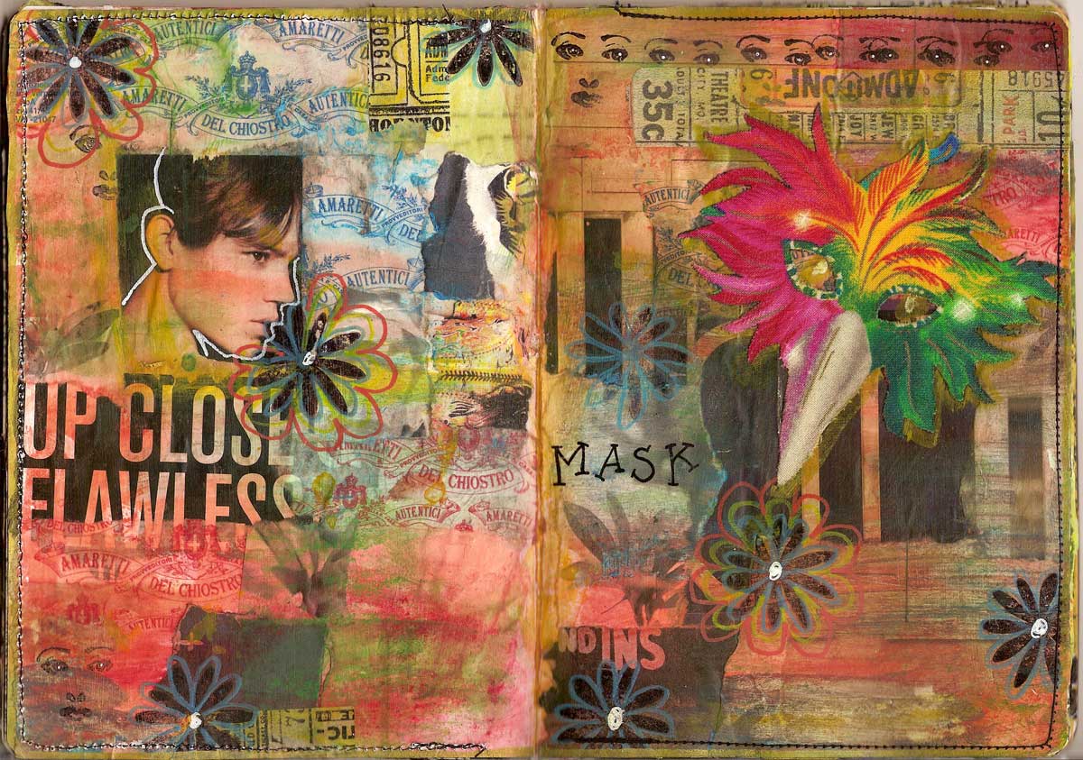
Up Close Spread
The next spread in my Unmasked sketchbook for the Capes, Masks and Capes Sketchbook Project has been completed and here it is. As the fabric mask I wanted to use looked a bit menacing to me I added a similar looking face on the other side to balance the arrangement. It's made in the usual way by collaging small pieces of paper using matte medium, adding such items as the wrappings of Amaretti biscuits. John is the one who eats them. I just buy them for the lovely tins they come in and the wrappings that add a touch of the exotic to any collage. There is quite a bit of stamping on this spread too, using flower and face stamps. Washi tape is also included.
You can the different elements quite well on the above detail. Only 3 more spreads to go to complete my sketchbook now, so well on the way as the sketchbook doesn't need to be shipped to the Brooklyn Art Library till August. In due course they will digitize it and it will appear with my other sketchbooks I did for the Sketchbook Project here.
Wednesday, 8 May 2013
Hiding spread
Sadly the sun has once again retreated behind dark clouds, the wind is up and it's raining, but the memory of yesterday's beautiful day still lingers. In the studio the next spread in my Capes, Masks and Tights sketchbook has been made, concentrating only on the Masks bit in the title. The spread has been made much like all the previous ones (if you want to see these, press on the unmasked label below this post or in the sidebar). Scraps of paper (mainly from mailorder catalogues but also including the wrappings of Amaretti biscuits) were collaged onto the page and painted over using watercolour paint. Stamping, doodling and outlining were added as shown.
You can see more of the details on these pages. The words are more used as graphic elements than as meaningful phrases.
The last thing I added was the fabric mask which was collage down using matte medium. The stitch lines you see are holding two pages together. I had to double the pages up as the pages in the Sketchbook send to me by the Sketchbook Project were too thin to cope with all that paint and glue. It also meanst I had less spreads to make which enhanced the quality of the individual spreads, I think.
You can see more of the details on these pages. The words are more used as graphic elements than as meaningful phrases.
The last thing I added was the fabric mask which was collage down using matte medium. The stitch lines you see are holding two pages together. I had to double the pages up as the pages in the Sketchbook send to me by the Sketchbook Project were too thin to cope with all that paint and glue. It also meanst I had less spreads to make which enhanced the quality of the individual spreads, I think.
Tuesday, 30 April 2013
Black Mask spread
My latest spread for my Unmasked sketchbook for the Sketchbook Project uses a lot of orange which is rather appropriate for today when a new king will be crowned in The Netherlands. He is the latest member of the House of Orange to reign over the country where I was born. Amazingly I left back when Queen Juliana was still on the throne, which makes me feel ancient. He is also the first man to rule the place after 3 queens and one queen/regent.
The sketchbook is one of a line of them done for the Sketchbook Project (you can see the previous ones here), and is dedicated to Masks although made for the Capes, Masks and Tights theme. It's made by collaging the pages with snippets of paper from a variety of sources and using matte medium to hold it all down before adding watercolour paints, washi tape, and stamping, until I was happy with how the pages looked.
Here is my favourite bit from this spread. I just like how that dreamlike face comes up from the depths.
The final touch is the addition of the black fabric mask, also adhered with matte medium. Because of the layers of paper and paint the pages of the sketchbook weren't really sturdy enough to cope so I sewed some of them together to provide a more solid background and it also meant I didn't have to worry about the paints leaking through to the back. You can see the sewing line clearly above. I could just as easily have glued them together but I prefer to use my sewing machine. That way I know they won't come apart!
I have the feeling that I'm going to find it rather more difficult than in previous years to part with this sketchbook but it will be in the collection of the Brooklyn Art Library for all time to come as well as being present online in digitized form.
The sketchbook is one of a line of them done for the Sketchbook Project (you can see the previous ones here), and is dedicated to Masks although made for the Capes, Masks and Tights theme. It's made by collaging the pages with snippets of paper from a variety of sources and using matte medium to hold it all down before adding watercolour paints, washi tape, and stamping, until I was happy with how the pages looked.
Here is my favourite bit from this spread. I just like how that dreamlike face comes up from the depths.
The final touch is the addition of the black fabric mask, also adhered with matte medium. Because of the layers of paper and paint the pages of the sketchbook weren't really sturdy enough to cope so I sewed some of them together to provide a more solid background and it also meant I didn't have to worry about the paints leaking through to the back. You can see the sewing line clearly above. I could just as easily have glued them together but I prefer to use my sewing machine. That way I know they won't come apart!
I have the feeling that I'm going to find it rather more difficult than in previous years to part with this sketchbook but it will be in the collection of the Brooklyn Art Library for all time to come as well as being present online in digitized form.
Subscribe to:
Posts (Atom)