After our trip to New York we were challenged by Judi Mendelssohn, the organizer of the PandQTours, to make a small quilt with the theme of: Window on New York.
To that end she gave us a piece of fabric from a line of New York themed fabrics exclusive to The City Quilter shop that we visited during the trip. Our challenge fabric shows Times Square and you can see it in
the background of my piece.
I took my inspiration of the beautiful Chrysler Building, my favourite skyscraper around in NY. I build it using a mix of fabric/paper collage and commercially available cottons. The size of the piece was decided by the piece of the Times Square themed
fabric we were given and it ended up 10.5 x 14.1/4" or 26.5 x 37cm.
The piece was machine appliquéd, hand and machine quilted, hand embellished with beads, sequins and Swarovski crystals most of which were bought while in New York.
Our challenge pieces will hang on Judi's stand for PandQTours at the Festival of Quilts, Birmingham during the show, 11th - 14th August so have a look if you're visiting.
After that I will be a treasured reminder of our New York trip.
Showing posts with label fabric paper collage. Show all posts
Thursday, 28 July 2016
Monday, 9 May 2016
Balance
The prompt for this week on Colour Me Positive was: Balance, and the art challenge to use a feather.
I found the quotation I wanted to use first and it reads: "Life is a balance of holding on and letting go". This set the theme for the spread done in the A4 Dylusions art journal. The background was made using the Circles, Circles stencil and the Ripple Effect stencil from Stencilgirl as well as stencils from the April 2016 Stencilgirl Club. I then stamped the text on using blue ink and the rubber stamp designed by France Papillon for Stampotique.
I collaged on the image of the balancing yoga figure with rocks and added paint on top to merge it with the background.
The rocks on the left were made using suitably coloured fabric-paper collage from my stash, cutting it into rock shapes and glueing them on, one on top of the other. The feather (from one of our own chickens) was glued on balancing on top.
The quotation that started it all was added, using a variety of different letters cut from magazines. As usual the page didn't seem complete to me till I added the postage stamp. Outlining with black and white markers came last and I also added the word "balance" in my own handwriting.
I found the quotation I wanted to use first and it reads: "Life is a balance of holding on and letting go". This set the theme for the spread done in the A4 Dylusions art journal. The background was made using the Circles, Circles stencil and the Ripple Effect stencil from Stencilgirl as well as stencils from the April 2016 Stencilgirl Club. I then stamped the text on using blue ink and the rubber stamp designed by France Papillon for Stampotique.
I collaged on the image of the balancing yoga figure with rocks and added paint on top to merge it with the background.
The rocks on the left were made using suitably coloured fabric-paper collage from my stash, cutting it into rock shapes and glueing them on, one on top of the other. The feather (from one of our own chickens) was glued on balancing on top.
The quotation that started it all was added, using a variety of different letters cut from magazines. As usual the page didn't seem complete to me till I added the postage stamp. Outlining with black and white markers came last and I also added the word "balance" in my own handwriting.
Sunday, 20 March 2016
Edina's Roses
This quilt came home with me yesterday after the meeting of Thistle Quilters. It had been part of Thistle's stand at the quilt show in Glasgow earlier this month. The quilt was the result of a challenge to make a quilt sized 18 x 24" on the theme of "Auld Reekie", a name by which Edinburgh is also known.
After some research I discovered that one of the reasons that this is the case, was the habit of domestic servants in the past, to empty the chamberpots from the top of tenement houses into the streets below with very unpleasant results, specially for the innocent passers-by below!
I found a poem written by Robert Fergusson in 1773 which contains the following lines:
"They kindly shower Edina's roses
to quicken and regale our noses"
This refers to that habit of emptying those chamberpots of their foul smelling content.
I grabbed that poetic image of roses to use in my quilt and thus was forced to buy a chamberpot on Ebay, a first for quilt supplies!
The background is a paper/fabric collage using vintage images of Edinburgh from books and an old newspaper, collaged on a calico (muslin in US speak) background using matte medium. The frame is hand drawn and cut from a rose fabric, and then machine appliquéd on using Bondaweb, with machine done double buttonhole stitch. It is embellished with size 11 seed beads.
The chamberpot is a photograph taken from that Ebay buy printed onto fabric and machine appliqued on. I then stitched on a selection of diferent rose buttons and beads, falling down in a steady stream over the background.
Wednesday, 10 December 2014
Grim outside, cozy inside
If yesterday's dog walk was bleak, today's was grim. It resulted in a complete change of clothes on my return home as I was utterly soaked. The wind raged against me and the snow hit me straight on. It has been wild here at Macbiehill and in fact still is. We briefly lost our electricity last night. It's back now but I'm doing this blog post and my blip now (10.00 am) just in case! And on a personal note , good luck to my mother. Hope all goes well!
While it's freezing outside inside it's all calm and tranquil. I did finish the appliqué phase of my latest quilt and you are getting a minuscule glimpse of it above. Just the colours make me feel warmer. All the fabrics were hand dyed by me a few weeks ago, with some dating back about 10 years also included. And the little squares (inchies) are parts from a wide variety of fabric paper collages.
Monday, 17 November 2014
Map Page
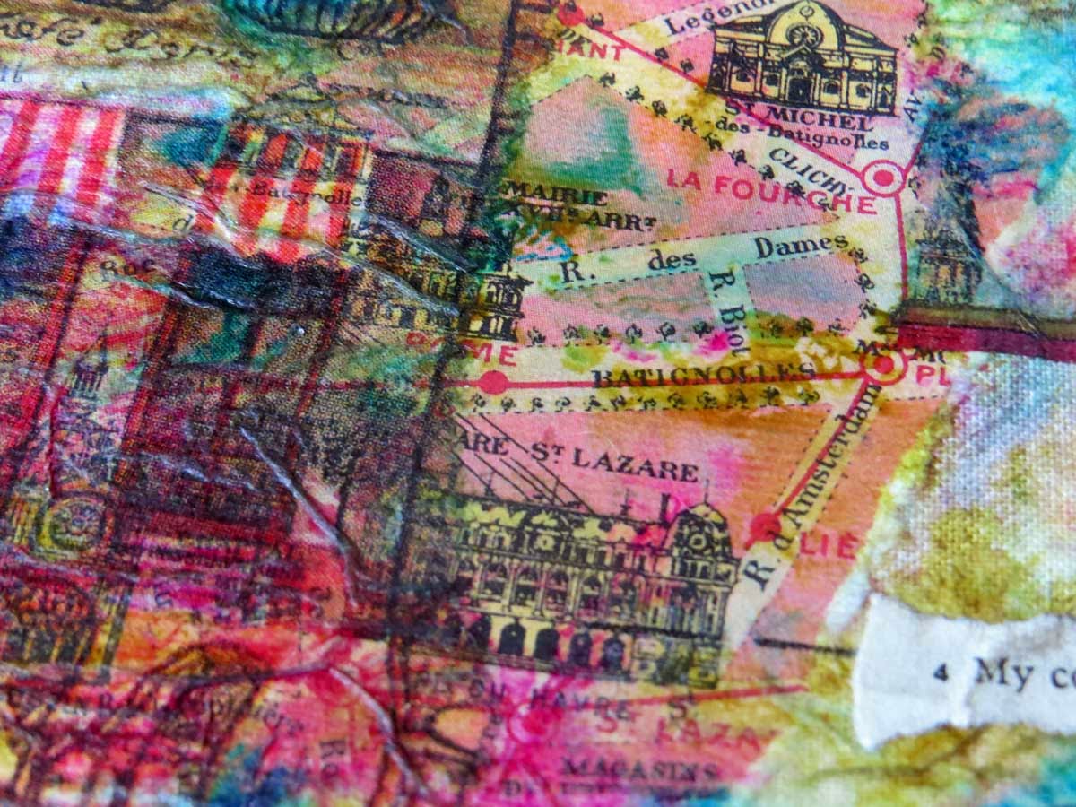
I must be honest and admit that I cheated for this week's Documented Life Project page. I simply don't have the time at the moment to spend a day making a page so I chose the easy option and selected to use something I already had. I used to make a lot of fabric paper collages (see a full tutorial on how I do mine on a very early blog post here). They seem to be very popular again at the moment. I knew vaguely that on one of them I had a map of Paris featured and as maps were our task for this week 47 I opened the box with left over pieces and found it. It had been kept as I couldn't bring myself to cut it up because I liked it so much, but as good luck would have it the piece I liked specially was just about the size of my planner (5 x 7"). So I cut it to size and liked it even better.
It has been made using a vintage street map of Paris, and a wide variety of paper napkins also featuring French themes as well as vintage French text. I only added a few other items to the mix, starting with the vintage text of "My country" (even though France isn't that, it somehow seemed to fit).
I also added the Polish (why not?!) postage stamp, mainly because that particular corner of the collage was quite dark and that brightened it up perfectly as well as providing a balance for the white of the text. I then edged the piece with a gold marker and called it done. This is also the very first page in my planner with a horizontal orientation.
For this year I haven't spend longer than maybe half a day on each page. I expect to dedicate more time to this project next year because first of all the journal we're using is much larger (A4 size) but also because I want to take it a bit more seriously, specially seeing how many ideas even the pages I made this year have given me. I will be making the pages next year over the course of an entire week, spending a bit of time every day. I might even make some pages in fabric. All this of course depends on how much time I have available in among many other projects. I always have to laugh when classes or books tell you that if you only spend 1/2 hour, 20 minutes or whatever small amount of time, on it every day, you will get a lot done. If I count up all the things I want to learn and add up those small amounts of time they will take I am faced with the fact that there won't be any time left to sleep or even breathe. So somehow I try and fit in as much as is humanly possible given the fact that a day only has so many hours and I have only 2 hands (a serious human design fault!). Somehow a balance has to be found and most of the time that seems to happen but there are periods when I simply have to put the brakes on certain of my activities.
Of course having looked through my box of left over fabric paper collages I now want to make more! And this afternoon I'm going to do some fabric dying! It's all so much fun and I cannot resist.
It has been made using a vintage street map of Paris, and a wide variety of paper napkins also featuring French themes as well as vintage French text. I only added a few other items to the mix, starting with the vintage text of "My country" (even though France isn't that, it somehow seemed to fit).
I also added the Polish (why not?!) postage stamp, mainly because that particular corner of the collage was quite dark and that brightened it up perfectly as well as providing a balance for the white of the text. I then edged the piece with a gold marker and called it done. This is also the very first page in my planner with a horizontal orientation.
For this year I haven't spend longer than maybe half a day on each page. I expect to dedicate more time to this project next year because first of all the journal we're using is much larger (A4 size) but also because I want to take it a bit more seriously, specially seeing how many ideas even the pages I made this year have given me. I will be making the pages next year over the course of an entire week, spending a bit of time every day. I might even make some pages in fabric. All this of course depends on how much time I have available in among many other projects. I always have to laugh when classes or books tell you that if you only spend 1/2 hour, 20 minutes or whatever small amount of time, on it every day, you will get a lot done. If I count up all the things I want to learn and add up those small amounts of time they will take I am faced with the fact that there won't be any time left to sleep or even breathe. So somehow I try and fit in as much as is humanly possible given the fact that a day only has so many hours and I have only 2 hands (a serious human design fault!). Somehow a balance has to be found and most of the time that seems to happen but there are periods when I simply have to put the brakes on certain of my activities.
Of course having looked through my box of left over fabric paper collages I now want to make more! And this afternoon I'm going to do some fabric dying! It's all so much fun and I cannot resist.
Thursday, 21 March 2013
3. Poetry of Life Journal Quilt
After yesterday's search for happiness I just want to add one more thing. As an artist I am so lucky that I find most of my own delight in my studio. Yes, things don't always go as planned there either but the sheer pleasure of being there and in the end coming up with a piece of work that turns out well provides me with a constant source of happiness that I can turn to in good times or bad.
And today I can show you the results of my labours. Above is my latest Journal Quilt made for the monthly theme set on the Sketchbook Challenge site and for this March it is: Natural Surfaces. This was never going to be all that easy specially as most of the natural surfaces outside are still covered in snow and ice and I didn't want to make an all white piece of work. So I started to consider alterantives and remembered
a Journal Quilt I made last year as part of the 52 Journals Project. This one was no. 34 called Digital Lilies and I had produced fabric digitally based on a photograph I had taken of a lily in our garden. You can read more about that process here. I still had lots of the lily fabric left and decided this was as good a time as any to use it again as it was definitely a natural surface albeit a heavily manipulated one. I used Bondaweb (WonderUnder) to collage the remnants onto the surface of my new Journal Quilt (sized 10" square), and after layering it with wadding and backing fabric, heavily machine quilted the surface with a large variety of variegated threads. I also did some hand stitching using yellow.
I then went on to add pieces of a fabric paper collage I had made many moons ago, on the theme of pansies and added 2 long strips and the piece seen above. They were stitched on by machine and then beaded using size 11 yellow seed beads.
As I wanted some additional surface texture I added 3 inchies, also made some time in the past, using heaving couching and stitched those on too, and beaded again along the edges. The final touch was an additional purple button on top. This whole journal quilt uses the complimentary colour combination of purple and yellow which you don't see used often enough in my opnion. I love it myself.
The text once again came from a vintage book as was stitched on. It reads: "The precious poetry of life".
And today I can show you the results of my labours. Above is my latest Journal Quilt made for the monthly theme set on the Sketchbook Challenge site and for this March it is: Natural Surfaces. This was never going to be all that easy specially as most of the natural surfaces outside are still covered in snow and ice and I didn't want to make an all white piece of work. So I started to consider alterantives and remembered
a Journal Quilt I made last year as part of the 52 Journals Project. This one was no. 34 called Digital Lilies and I had produced fabric digitally based on a photograph I had taken of a lily in our garden. You can read more about that process here. I still had lots of the lily fabric left and decided this was as good a time as any to use it again as it was definitely a natural surface albeit a heavily manipulated one. I used Bondaweb (WonderUnder) to collage the remnants onto the surface of my new Journal Quilt (sized 10" square), and after layering it with wadding and backing fabric, heavily machine quilted the surface with a large variety of variegated threads. I also did some hand stitching using yellow.
I then went on to add pieces of a fabric paper collage I had made many moons ago, on the theme of pansies and added 2 long strips and the piece seen above. They were stitched on by machine and then beaded using size 11 yellow seed beads.
As I wanted some additional surface texture I added 3 inchies, also made some time in the past, using heaving couching and stitched those on too, and beaded again along the edges. The final touch was an additional purple button on top. This whole journal quilt uses the complimentary colour combination of purple and yellow which you don't see used often enough in my opnion. I love it myself.
The text once again came from a vintage book as was stitched on. It reads: "The precious poetry of life".
Monday, 4 March 2013
Art Exchange
Many people who know me well are also aware that my studio is a veritable treasure trove of goodies and whatever you're looking for in the way of supplies it's a fair bet that somewhere I will have something that suits. The reason I have so much (quite apart from my magpie tendencies!) is that when I'm in the creative zone I don't want to stop in order to go somewhere and buy the supplies I need for that particular piece. Living in the country as we do that usually means a day excursion and I lose the flow! Instead I buy stuff that I love whenever I see it anywhere or alternatively buy during late night online shopping expeditions. But making sometimes very large quilts means that even my supplies occasionally do get depleted. One supply that I can never get enough of is that of small, white, vintage buttons and recently I even moaned on this blog about just how fast they seem to disappear into art.
One of my regular blog readers, Jewels, contacted me by e-mail to tell me that she has a large stash of them and offered to swap some of them for a piece of my art. And here is the piece in question. It's called the Bird Inchie quiltie for obvious reasons! The imagery on this little quiltie comes from Alphastamps and the inchies were made using my fabric paper collage method. If you are interested in how that is done, just click on the fabric paper collage label below and the oldest post there will explain it step by step.
In exchange I received a gorgeous package from Jewels filled with beautiful vintage buttons and other goodies. Yummy! Only problem is they are so lovely that I will be saving them for that extra special project I'll make one of these days! You can read more about this and see more pictures on Jewels' blog post here.
One of my regular blog readers, Jewels, contacted me by e-mail to tell me that she has a large stash of them and offered to swap some of them for a piece of my art. And here is the piece in question. It's called the Bird Inchie quiltie for obvious reasons! The imagery on this little quiltie comes from Alphastamps and the inchies were made using my fabric paper collage method. If you are interested in how that is done, just click on the fabric paper collage label below and the oldest post there will explain it step by step.
In exchange I received a gorgeous package from Jewels filled with beautiful vintage buttons and other goodies. Yummy! Only problem is they are so lovely that I will be saving them for that extra special project I'll make one of these days! You can read more about this and see more pictures on Jewels' blog post here.
Friday, 7 September 2012
La Serenissima up close
My quilt La Serenissima came home yesterday from the Great Northern Quilt Show, held in Harrogate last weekend and what is even nicer, she came accompanied by a large blue rosette for 2nd Prize in the Large Wallhangings category. She's sized 18.3/4" wide x 42. 3/4" which made one side large than 40, hence the Large designation although in fact this is one of my smaller quilts. If you're interested in how she was made you can read about it in an earlier post.
Above is an overview of the quilt but today I decided to zoom in to the details, specially as I can now show these to you so much larger! Oh, the joy of being connected to the big world out there via broadband so that I could finally change my blog template and the width of the centre column! The other thing that spurred me on to get closer is the Close Up theme for the Calumet Group on Blipfoto for this week.And here they are; some very close views of the larger pieces of the fabric paper collages that are appliqued onto the quilt by machine and then framed with seed beads. As you can see I use a whole lot of different things to make my collages which are made on a background of calico (muslin if you're in the States), including stamping, vintage text, paper napkins, fabric paints (mainly Dye-na-Flow) and PVA glue. I don't mind the fact that when adding the top layers of napkins I get some texture as it's so thin. To me it all adds to the interest and in all truthfulness I'm too messy a worker to straighten it all out. Most of the stamps came from Alpha Stamps.
And some of them such as this stairway from Stampfranciso. I have a rather large collection of Venice related stamps, collage sheets, and other paraphernalia which come in handy as I don't foresee I'll stop making Venice related and inspired art any time soon.
But the picture that said Close-Up most to me was the one at the very top of this post which will become my blip for today. It really focusses in on the details of all the painting, splashing, spraying, stamping and stencilling I did on the background which I had machine quilter already as well as on my inchies, also made out of fabric paper collages.
Thursday, 6 September 2012
36. A Starry Night Journal Quilt
The last 4 months of the year are looming and that means that the last 4 Journal Quilts for the Contemporary Group of the Quilters' Guild of the British Isles have to be blue. We've had yellow and red, so we're covering all the primaries. I'm incorporating mine into my own 52 Journals project where I aim to make one Journal Quilt for every week this year. Fortunately the size for the Contemporary Group has to be A4 Portrait Orientation which fits in well as most of the weekly JQs I'm making are also that size. I had no trouble finding an inspirational photograph for the yellow and reds but had serious difficulties with blue.
Eventually I found a collection of fabrics onto which I had printed winter photographs using TAP (Transfer Artist Paper). I can no longer remember when or why I did so but I think it was to test how transparent the transfers were on patterned fabric. It was probably for a particular purpose but whatever it was, it never came to anything and I decided that rather than using just one photograph as inspiration for the blues I would use a selection of those transferred to fabric pictures. They all are wintery and bluish in character, which seems a bit funny for September but keep in mind that the last one I'm making will be produced in December. And keeping them all in a winter atmosphere should hopefully make them look good together. The first photograph which I'm using on this journal quilt, features frozen dead flower heads transferred to a fabric with a butterfly pattern.
I went back to basics, as this is really like a strippy quilt, with the strips going horizontally. I used a silver lame with blue stars which is very blingy (a bit lost in the photographs) that was machine quilted outlining the stars. One strip features my by now familiar inchies (made from fabric paper collage), and they were hand quilted and beaded. The next strip is a blue hand-dye to which I added starry stamps and the transferred picture fabric as well as starry embellishments. The bottom strip was embellished with silk hand dyed circles with hand stitching and beading. I used a couched down fluffy yarn to separate the strips.
Text was added to the strip with the photograph, which reads: " Waters on a starry night are beautiful and fair". The water is shown in the bottom strip with the circles and the stars, of course, are up at the top.
I hand sewed beading along the edges of the binding which is my usual finishing touch for these journal quilts.
Remember you can see a slideshow of all the journal quilts I've made so far for the 52 Journals project in the sidebar and read all about each one by clicking on the 52 Journals label below this post.
Eventually I found a collection of fabrics onto which I had printed winter photographs using TAP (Transfer Artist Paper). I can no longer remember when or why I did so but I think it was to test how transparent the transfers were on patterned fabric. It was probably for a particular purpose but whatever it was, it never came to anything and I decided that rather than using just one photograph as inspiration for the blues I would use a selection of those transferred to fabric pictures. They all are wintery and bluish in character, which seems a bit funny for September but keep in mind that the last one I'm making will be produced in December. And keeping them all in a winter atmosphere should hopefully make them look good together. The first photograph which I'm using on this journal quilt, features frozen dead flower heads transferred to a fabric with a butterfly pattern.
I went back to basics, as this is really like a strippy quilt, with the strips going horizontally. I used a silver lame with blue stars which is very blingy (a bit lost in the photographs) that was machine quilted outlining the stars. One strip features my by now familiar inchies (made from fabric paper collage), and they were hand quilted and beaded. The next strip is a blue hand-dye to which I added starry stamps and the transferred picture fabric as well as starry embellishments. The bottom strip was embellished with silk hand dyed circles with hand stitching and beading. I used a couched down fluffy yarn to separate the strips.
Text was added to the strip with the photograph, which reads: " Waters on a starry night are beautiful and fair". The water is shown in the bottom strip with the circles and the stars, of course, are up at the top.
I hand sewed beading along the edges of the binding which is my usual finishing touch for these journal quilts.
Remember you can see a slideshow of all the journal quilts I've made so far for the 52 Journals project in the sidebar and read all about each one by clicking on the 52 Journals label below this post.
Saturday, 25 August 2012
Of Immortality
![]() |
| Of Immortality |
I should have revealed this quilt to you back in May when it was first exhibited in Germany but completely forgot to do so. It's just been on show again, this time at the Festival of Quilts in Birmingham last weekend and this time I'm rectifying making it public by showing it here on this blog too. The idea came from a cooperation between the German and British Quilting Guilds. Members from both guilds were invited to send a pack of fabric (about 5 fat quarters) to their own guilds and these were then exchanged so that a German quilter would receive a pack from a British quilter and vice versa.
You can see the fabrics I send to Germany in an earlier blog post here and here. And a bit further down in this post is the fabric I received from a German quilter about whom I only know that her last name is Bitler and she lives in Bad Meunden. The fabric was okay but not at all what I usually have in my work and it took me some time to get around that problem. In the end I used two of her fabrics, added 3 of my own (2 in the body of the quilt and the gold fabric for the binding), sewed them together in a Fibonacci sequence, machine quilted the layers using straight machine stitching and then proceeded to paint the entire piece starting with a layer of white emulsion paint. I then splattered, sprayed, stencilled, stamped and in general messed around with it till I achieved something I was happy with. It took days to dry!
I then added inchies and larger pieces from a fabric paper collage I made on the theme of flowers and butterflies. The size of the quilt was a given and it had to be 16" wide by 32" long. The title came from one of the fabric paper collage pieces where I discovered it quite accidentally on one of the vintage texts I had used in the collage. I love it when coincidence or synchronicity as I like to call it, steps in to help me.
Of course there is lots of beading too as you can see on the detailed photographs above.
![]() |
| the fabrics I received from the German quilter |
Both guilds selected 30 works from among their submissions and these 60 works were then exhibited together with the sheet for each quilt
![]() |
| Detail from the exhibition as it hung at the Festival of Quilts, Birmingham |
I wasn't in Birmingham myself to see the exhibition and it's thanks to Gillian Cooper that I can show you the two pictures here of the quilt hanging at the show. I'm hoping there will be a bit of a write-up about this exhibit somewhere as I would quite like to see the other quilts in more detail. I would also love to know if whoever in Germany received my fabric pack made it into the show or not.
![]() |
| A close-up from Birmingham |
This quilt was the prototype for another quilt which I have already shown you called La Serenissima which was exhibited at the Thistle Quilters exhibition earlier this summer. I love the quilt first, paint later method and you can expect to see it again in future.
Thursday, 26 July 2012
30. Triangles Journal Quilt
When I used all those delectable Oakshott fabrics for my journal quilt last week, they were left laying on my desk and seemed to call my name again. I decided to answer and make another journal quilt using both them and remnants from a large variety of fabric paper collage pieces.
I also let myself be inspired by a small quilt I made 2 years ago for a challenge set by the Thistle Quilters and which you can see above, called Fluttering through Time (read my post about it here). Making that quilt had been such a joy that I was keen to repeat the experience and this Triangles one (A4 size) did not disappoint. It could have been made without using my Xyron machine with the fabric glue cartridge but it would have taken so much longer! Needless to say I also stitched and beaded and as I still had a selection of the large, sparkly beads left from Fluttering I added those too. The camera is never all that good with the bling but it certainly shows you where the embellishments are!By the way, if you're interested in making your own fabric paper collages you can read a step by step tutorial in a much earlier blog post here.
Thursday, 14 June 2012
24. Art Makes Life Journal Quilt
This is one of those Journal Quilts that just happen, for no other reason than that I wanted to return to something I did in the past.Because the 52 Journals project is entirely my own I went ahead and did it. It's loosely based on the 3 Journal Quilts dedicated to Venice (you can see one here) I made some years back and which were on show in my colour-quilts-collage exhibition last year where all 3 were sold. This time I divided the A4 space into 16 rectangles (simply by folding a sheet of A4l) and added some of my favourite things in the spaces. I used fabrics I hand painted last summer and which were all decorated with dotty circles, still my most favourite shape of all time. Three pieces of a fabric-paper collage with an Art theme were sewn on as well as a photograph of valerian printed onto fabric. 3 big buttons bought recently were added as well as a sparkly F (a gift) to signify it's my JQ! Further decoration was provided by a peacock (from an old earring) and 2 metal butterflies painted with a variety of acrylics and metal rubbing colours. Of course I could not help myself and beaded the entire piece liberally. Hand dyed lace was the final touch.
I used a Monet themed fabric for the backing and found it also made for a pleasing border.
This piece has no serious message like some of the other ones have. It's simply a piece of froth and bubbles, made for my own delight. The title comes from one of the fabric paper collage pieces.
Remember if you want to see all the previous Journal Quilts I've made for the 52 Journals project you can click on the relevant tag below or have a look at the slideshow in the sidebar.I'm nearing the half way point!
I used a Monet themed fabric for the backing and found it also made for a pleasing border.
This piece has no serious message like some of the other ones have. It's simply a piece of froth and bubbles, made for my own delight. The title comes from one of the fabric paper collage pieces.
Remember if you want to see all the previous Journal Quilts I've made for the 52 Journals project you can click on the relevant tag below or have a look at the slideshow in the sidebar.I'm nearing the half way point!
Monday, 14 May 2012
La Serenissima
The hanging is very mixed media but with some of the traditional elements of a quilt. It's layered with a wadding inside but for the rest it's very different. Painting, splashing, stencilling and stamping was used to make the background fabrics merge into each other. The images and inchies are from a Venice themed fabric-paper collage, all from the same one, made specially for this quilt. Then of course there is lots of beading, all using size 11 seed beads. The title was produced with fonts on my computer and printed onto voile and then sewn on. I love the turquoise colour that in the end, after all the paint processes, proved to be the dominant one that appeared. The quilt sparkles not just with the beads but also due to spraying with a variety of sparkly paints and mica, but sadly that effect is mostly lost on the pictures. It's back home now but will no doubt be back on its travels to other exhibitions before long.
Lenna's comment (see below) reminded me that I had forgotten to mention the size of this piece so here it is: La Serenissima is 18.3/4" wide x 42.3/4" wide!
Sunday, 15 April 2012
Debby's 4 x 4

This is the very last 4x4 I'm making for our exchange on the closed OhMyGothic group. The idea was that we make one 4x4" sized piece of art for another artist in the group every month and also receive one ourselves. It's rather fitting that the last one I'm making is for Debby as it was she who set up this exchange, where we started by swapping gothic arches, then continued to little houses, Skinny pages and finally the 4x4s. The group is carrying on but I'm really too busy to continue and I don't want to end up resenting having to make art under such pressure. I'm also sure that wouldn't lead to my best efforts which would be unfair to everyone else. So although I will be sad to say goodbye I know it's the best move for me at the moment.
The background for this piece is a fabric-paper collage in which I used a paper napkin with cutlery imagery on it. To that I added the transparency girl (from Divas d'Este) and the butterfly which is 3D although you can't tell this from the scan. The vintage text says With forks and hope.
I finished the edges with my usual satin stitching and beading.
Monday, 13 February 2012
Brenda's 4 x 4

The project where every month a group of artists make 4 x 4 pieces for each other is almost coming to an end. After this one there is only 2 more to go.
For this month I had to make my 4" square piece for Brenda who had chosen as her theme Butterfly Garden.
I used a piece of fabric-paper collage as my background and stitched this onto green felt. To this were added three transparencies of butterfly wings (Artchixstudio) which were stitched on and then surrounded by size 11 seed beads in a mix of colours. The transparency text (also from Artchixstudio) says: On wings of music.
The back (decorative paper) was added to the piece and the layers were then stitched together using a satin stitch and green thread.
Sunday, 4 December 2011
Trinka's 4 x 4

Another month, another 4 x 4. This time for Trinka, who didn't really specify a theme but among other things she likes maps. So a piece of a fabric - paper collage with a map of Paris included, made some considerable time ago, seemed to fit the bill. I added the vintage fabric lady (from a postcard in my own collection) as well as a rubbed off butterfly and the text (from an Alpha Stamps collage sheet).
Saturday, 26 November 2011
Lisa's 4 x 4

It's high time to show the 4 x 4 for this month, which I'm making for Lisa. Although she didn't give us a specific theme, I know that she shares my taste for graveyards and grave monuments so I followed that inclination which suited me (as well as her) well.
I used a fabric - paper collaged background with a lavender theme colourwise. Purple is per tradition a mourning colour so it also went very well with the photograph I added. It's from the Temple graveyard we visited earlier this summer. The gothic arches you can see in the background are part of a vintage image which was incorporated into the original fabric-paper collage. I used rub-ons to add the clock, the arrow as well as the words Past, Present and Future. The text (O, beauty, conqueror of all) is from a vintage book. The collage was layered with felt and paper and then zig-zag sewing and seed 11 purple seed beads were added along all the edges.
Monday, 10 October 2011
Linda's 4 x 4

Every month I make a small collage (4 x 4") for another artist in the (closed!) OhMyGothic Yahoo group and in return I receive one from someone too (my theme is flowers). We have worked our way through Gothic Arches (hence the name of the group), houses as well as skinny pages and I for one am quite content with the 4 x 4 size.
For October I made the 4 x 4 for Linda who had set a theme of joy for her 4 x 4s. I started with a piece of the required size of a fabric paper collage in pink and green colours. The text on it reads: When the heart speaks, you must stop and listen. I then added a Victorian scrap lady to this as well as the word JOY. I stitched the letters with red thread and also used that to outline the two large heart images which were part of the original collage. One of the hearts was also beaded with size 11 gold seed beads. I layered the collage with felt and decorative paper and stitched around the edges with a green satin stitch, using my sewing machine. Finally I added the layered paper flowers in the bottom left corner.
Thursday, 15 September 2011
Leslie's 4 x 4

I'm a member of a group (OhMyGothic Yahoo Group) which started up some years ago to exchange Gothic Arches with other artists (hence the name). We continued with house shapes and followed that with Skinny Pages. For this round we swap 4 x 4" pieces, so make one for another artist ourself each month as well as receive one ourself. The group is closed as we're in the middle of a long swap (it will go on well into next year) so no new members are being accepted at present.
This month it was my turn to make 4 x 4 for Leslie and she had set as her theme Wings. She also stated that she likes birds, and chickens are birds, right?! I made a fabric paper collage and used a paper napkin featuring chickens as part of the collage. The text (don't chicken out now) was added by Dymo writer. Further circular embellishments were added as well as black German scrap which reminded me of a fence. Finally the piece was mounted onto felt and watercolour paper, sewn together around the edges and beaded with green size 11 seed beads.
Tuesday, 13 September 2011
Goodbye ATC

The most recent issue (no. 24) of the ATCquarterly Magazine arrived today. The next issue will sadly be the last and I for one will miss reading the only magazine dedicated to Artist Trading Cards. Appropriately the very last challenge theme is: Goodbye. And that made me think immediately about gravestones (well, I'm fairly obsessed with them anyway). So I used a sunny and bright fabric paper background and then printed out one of my photos, featuring a gravestone in West Linton Graveyard (and if you want to see more, check out my other blog on this subject).
On top of that I added Goodbye (done with my Dymo writer). Along the side I added: "it was so much fun while it lasted", something that I would quite like to see on my gravestone and that would be suitable both for the end of me as well as for describing the end of ATCquarterly!
The edges were finished with dotty Japanese tape and then stitching.
This was my ATC for the previous challenge Dog Days, as it was published in issue 24 of the magazine. You can read how I made it on a previous blogpost here.
Subscribe to:
Posts (Atom)