Showing posts with label Alphastamps. Show all posts

Sunday, 19 November 2017

Stop Clowning Around

Our mission this week for Joggles Art Journal Adventures was to do something with the prompt: Clowns. My heart sank just a bit as I read the words because it's very far from a favourite subject and I also knew that in the process of destashing I had recently got rid of quite a lot of my collage materials (still plenty left, don't worry!). I knew getting rid of so much stuff would mean I would eventually come up against missing something, I just hadn't thought it would have happened within a week!

Among that missing lot were some sheets from Alphastamps featuring clowns. But hurray I still had one sheet and put that to good use on the right-hand page, cobbling together various elements (sadly no arms!). That still left a gap on the left but while sorting through my fabric I had unearthed one with a circus related theme. Had you asked me if I had such a fabric in my possession I would have fervently denied it but there it was. No idea where it came from.

I ironed Bondaweb to the back of the 3 clown faces, cut them out and ironed them onto the page. This is something that has to be done carefully as the acrylic paint on the background is not that happy with lots of heat. I used a medium heat setting on the iron and a baking sheet and augmented that with a glue stick for the bits that hadn't adhered too well.
The background was done with a wide variety of paint colours and the S451 Woven Small stencil from Stencilgirl Products. The white circles come from the same stencil. The circus figures were outlined with a black Stabilo All pencil. To make the circles stand out even more they were marked with water soluble oil pastels.
 Vintage text was added and the title was done on a Dymy writer with self-adhesive transparent tape.

Tuesday, 2 May 2017

The Smell of Ink

As part of the Wanderlust 2017 classes we get prompts for our Wanderlust book. The latest one told us to finish the following sentence: "I treasure this memory from childhood, the smell of ....."  The first thing I thought of was the smell of ink. An ink pen was how I learned to write and I still love the smell of it. Some magazines arrive and the first thing I do is stick my nose in them to breathe in that smell. And fountain pens have become the rage again all of a sudden. I bought one and it reminded me so much of my student days, scribbling notes down as quickly as possible using a pen filled with red ink!
These pages were done in Finnabair's Mixed Media Journal on some of the craft pages it contains. I gessoed them first though, so started on a more or less white background. Then I collaged on some images mainly coming from collage sheets by Alpha Stamps about the alphabet combined with the inside of an envelope as well as other ephemera. I also obtained the rubber stamps of ink pots and pens from Alpha Stamps.
Colour came next using acrylic paint and Distress Crayons combined with S309 Juxta Pose stencil from StencilGirl Products.  The focal point words come from the medium stencil  in the November 2015 Stencilgirl Club, designed by Seth Apter. The word WRITE on the left hand page was stamped using the alphabet set designed by Everything Art for PaperArtsy.
 Finally I sprayed through the Juxtapose stencil  with gold mica Precious Pearls. With my fountain pen I wrote the words: The Smell of Ink, on the side of the page. The postage stamps in matching colours were the final addition to this spread. I just can't help myself.

Sunday, 14 September 2014

Feather Page

There is not much time for art at the moment but I did manage to produce my page for week 38 of The Documented Life Project. We were told to: Draw, paint, doodle, sketch a feather, or use a real feather on our page. As you can tell I used a real feather from one of our chickens that is conveniently moulding. She has lovely speckled feathers and I found an almost perfect example.
For the background I used a previously made gelli print and I found a matching bird transparency (from Alpha Stamps). Both the feather and the transparency were sewn on as you can see in the detail above.
I added a detail from a French dictionary page about the definitely of bird (oiseau), which mentions that these are "couvert de plumes", or covered in feathers. I added three more bird transparencies and stamped some leaves at the bottom of the page and antiqued the edges with a vintage inkpad. and did some outlining with a sepia pen. And voilĂ , the page was done!

Monday, 4 March 2013

Art Exchange

Many people who know me well are also aware that my studio is a veritable treasure trove of goodies and whatever you're looking for in the way of supplies it's a fair bet that somewhere I will have something that suits. The reason I have so much (quite apart from my magpie tendencies!) is that when I'm in the creative zone I don't want to stop in order to go somewhere and buy the supplies I need for that particular piece. Living in the country as we do that usually means a day excursion and I lose the flow! Instead I buy stuff that I love whenever I see it anywhere or alternatively buy during late night online shopping expeditions. But making sometimes very large quilts means that even my supplies occasionally do get depleted. One supply that I can never get enough of is that of small, white, vintage buttons and recently I even moaned on this blog about just how fast they seem to disappear into art.

One of my regular blog readers, Jewels, contacted me by e-mail to tell me that she has a large stash of them and offered to swap some of them for a piece of my art. And here is the piece in question. It's called the Bird Inchie quiltie for obvious reasons! The imagery on this little quiltie comes from Alphastamps and the inchies were made using my fabric paper collage method. If you are interested in how that is done, just click on the fabric paper collage label below and the oldest post there will explain it step by step.

In exchange I received a gorgeous package from Jewels filled with beautiful vintage buttons and other goodies. Yummy! Only problem is they are so lovely that I will be saving them for that extra special project I'll make one of these days! You can read more about this and see more pictures on Jewels' blog post here.

Thursday, 20 December 2012

51. Stoclet Journal Quilt

I'm nearing the end of the 52 Journals project and just had to make at least one journal quilt inspired by one of my most favourite artists: Gustav Klimt. This Austrian artist is a master of decoration and also used a lot of gold in his work so a man after my own heart.
The Knight, one of the 3 panels that together form the Stoclet Frieze, is a piece I've always loved which might well have something to do with the fact that when you look at a picture of it (see above) it could just as easily be a quilt as a painting. It's hanging in the Dining Room of the Stoclet Palace in Brussels. This house is still in private hands and is not open for public visits so at the moment there is no opportunity to see it in person, although the entire house is now a Unesco World Heritage site. This panel in itself could inspire many pieces and in fact Klimt's work could have provided me with the inspiration for all my 52 Journals! Now there is a thought! If you look for instance at the square filled with triangles at the bottom you can see that was the start for my Fluttering wallhanging. 
For this Journal Quilt I choose the area slight higher and drew it as a pattern using my Electric Quilt computer program. At first I wanted to use it as a strictly geometric pattern but in the end decided that random would be more to my taste and using my collection of batik remnants set to work piecing away and you can see the result at the top. I then machine quilted over the entire surface of the piece with a variegated thread. That worked quite well but the journal quilt  needed something else to finish it.
And I found that something else in the shape of inchies. This was a rage some years ago, with the idea being to make art on a 1" square.
I looked around again for something to make the inchies out of and found what was left of the background of a fabric postcard made many years ago, called Forest Lovers and which you can see above (the image of the lovers is from Alpha Stamps). I had enough left to produce 7 inchies which I spread over the surface of the journal quilt as you can see above and then followed in Klimt's footsteps by beading around them using real gold seed beads. Of course the edges along the binding were also beaded.

So this is it, no. 51, and only one left to go! Remember you can see all the JQs thus far on the slideshow in the sidebar here or by clicking on the 52 Journals label below this post.

Wednesday, 31 October 2012

Halloween

Specially for Halloween I photographed this art piece of mine (A4) which was made some years ago and was quite significant in the development of my work. It has never been exhibited as I know that not everyone shares my taste for death and its rituals, the macabre and strange. In the Victorian era the only time children were photographed was very often after their death to provide a lasting reminder of them. So many children died in their infancy (as can be seen in any graveyard) and for the parents such a photograph must have been worth the money that was needed to take it (almost always by a professional photographer). I've incorporated some of these on this piece (from a collage sheet from Alpha Stamps), as well as other death related symbolism. This piece is close to my own heart and is on show on a permanent base in my studio. So for today I'm giving it a public showing here and as my blip for today.

Sunday, 16 September 2012

Which Way to Hell?

The latest issue of The Quilter magazine (published by the Quilters' Guild of the British Isles) arrived within the past few days and in it was an article about the CrossRoads project of the European Quilt Association (EQA). It showed photographs of the CrossRoads quilts from various countries as they were displayed at Festival of Quilts this past August in Birmingham. That reminded me of the fact that I hadn't shown this piece to you yet since it was selected way back last year. Each of the EQA countries (18 in total) was asked to provide 10 20 x 50 cm quilts with a landscape orientation on the theme of CrossRoads. I was one of those selected by the British Guild, to my total astonishment I have to add. I thought the way I had interpreted the theme might have put people i.e. selectors, off!
I consulted my big book on symbols (The Book of Symbols; reflections on archetypal images, published by Taschen) which told me that crossroads have always been viewed as  places of extreme potency  and ancient travellers used to offer sacrifices there. According to the book "crossroads is where a pact with the devil is made" and it is the place where "one confronts the necessity of choice and the immensity of fate". It was also thought that there was an opening to the underworld at crossroads.
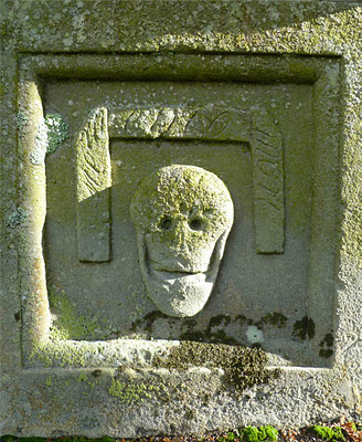
I took this very literally and selected an actual crossroads in our little lane, where north leads to Penicuik, south to West Linton, east to our house (and beyond) and west to the A702. Don't worry though if you're local. To date I haven't encountered the devil there nor found the entrance to hell. Nor are there any gravestones to be seen but once I had introduced the devil on horseback to the crossroads the graves seemed to be a vital accessory. And of course I have so many pictures of beautiful gravestones that just occasionally I want to put them to good use.

This is in essence a simply landscape quilt which is machine appliqued, and hand stitched.in a variety of running stitches as you can see on the details. I've taken the liberty of making our tarmacked little lane into a cobbled one, to make it more interesting from a textural point of view and added some flowers around the graves too. Just because I wanted some colour. The devil on his splendid horse is a fabric image from a collage sheet by Alpha Stamps.

I'm not quite sure when these quilts are coming home or whether they will be travelling and if so, just how many crossroads they will pass, but I hope that an encounter like the one on this particular quilt will be spared them.

I found the size and orientation pretty difficult to work with but I am very pleased with the finished product!

Friday, 7 September 2012

La Serenissima up close


My quilt La Serenissima came home yesterday from the Great Northern Quilt Show, held in Harrogate last weekend and what is even nicer, she came accompanied by a large blue rosette for 2nd Prize in the Large Wallhangings category. She's sized 18.3/4" wide x 42. 3/4" which made one side large than 40, hence the Large designation although in fact this is one of my smaller quilts. If you're interested in how she was made you can read about it in an earlier post.
Above is an overview of the quilt but today I decided to zoom in to the details, specially as I can now show these to you so much larger! Oh, the joy of being connected to the big world out there via broadband so that I could finally change my blog template and the width of the centre column! The other thing that spurred me on to get closer is the Close Up theme for the Calumet Group on Blipfoto for this week.
And here they are; some very close views of the larger pieces of the fabric paper collages that are appliqued onto the quilt by machine and then framed with seed beads. As you can see I use a whole lot of different things to make my collages which are made on a background of calico (muslin if you're in the States), including stamping, vintage text, paper napkins, fabric paints (mainly Dye-na-Flow) and PVA glue. I don't mind the fact that when adding the top layers of napkins I get some texture as it's so thin. To me it all adds to the interest and in all truthfulness I'm too messy a worker to straighten it all out. Most of the stamps came from Alpha Stamps.

And some of them such as this stairway from Stampfranciso. I have a rather large collection of Venice related stamps, collage sheets, and other paraphernalia which come in handy as I don't foresee I'll stop making Venice related and inspired art any time soon.

But the picture that said Close-Up most to me was the one at the very top of this post which will become my blip for today. It really focusses in on the details of all the painting, splashing, spraying, stamping and stencilling I did on the background which I had machine quilter already as well as on my inchies, also made out of fabric paper collages.

Thursday, 30 August 2012

35. Of Death Journal Quilt


I've reached no. 35 in my 52 Journals project where I aim to make one small journal quilt (this one is A4) for every week of 2012. And this one has been inspired by that quite contradictory smiling skull seen below.
The skull formed part of the table gravestone of James Deans who died in 1764. His stone is located in Glenholm Graveyard and you can read about that graveyard in one of my earlier graveyard blog posts here. The photograph had been lingering on my desk for quite some time and I decided to turn it into a journal quilt this week.

 In order to do so I printed hms out onto a denim cotton fabric sheet (Crafty Computer Paper), layered him with wadding (batting in US speak) and adorned him with a wealth of hand embroidery using cross stitches.
For some reason cross-stitch has gained a bit of a bad reputation among art embroiderers. Completely undeserved as it's a wonderful stitch to add texture specially if you use a variety of yarns and sizes of stitch as you can see in detail above. The stitched skull was machine appliqued (using a double buttonhole stitch) onto a machine quilted background. The red fabric is vintage and came originally from a Belgium convent. It was bought by me on Ebay. I added a cotton binding picking up the colours from the skull. Beading was added around both the binding and the skull as well as in his eyes. Vintage text was added too as shown, once again taken from the vintage book Proverbial Philosophy by M. F. Tupper, published in the 1860s. Text from this book is featured in quite of few of the 52 Journals and has become a kind of leitmotiv for them.  It gave this JQ it's title and the rest of the text that I added that reads as follows: " Death, new tenant of the house, pervadeth all the fabric" and further down: " Death, cold and lonely, thy frigid face is hateful". A bit unfair on the old chap as he seems to be having a large grin on his face.

I also added a red rose embellishment to the bottom left (from Alpha Stamps).

Remember if you want to see all the JQs so far for my 52 Journals Project you can either watch the slideshow in the sidebar of this blog or click on the 52 Journals label below this post and it will take you to all the posts here related to the project.

Tuesday, 13 March 2012

Connie's 4 x 4


I'm almost done with the 4 x 4 exchange. Only one more to go after this one. In this project which has taken over a year to complete a group of artists exchange a 4x4" sized page which we can all put together into a book if we so wish. This month I'm making mine for Connie who had set as her theme: Mainly White with one other colour, and she also listed under her list of favourites that she likes vintage children. I must be honest and admit that they're not what rocks my boat but I managed to find a lovely image of one on a collage sheet by Alpha Stamps


The background of this piece was put together on a square piece of Fast2Fuse onto which white fabrics, laces and silks were ironed on and then stitched. As the additional colour I choose aqua to go with the colour in the fabric image. That too was stitched onto the background as well as the text (from a ribbon): Laugh often. After a dental visit today I was not really in the mood for that either!


Another fabric was ironed on to the back of the Fast2Fuse and the edges were first stitched together, then a transparent ribbon was added as well as beading with aqua size 11 seed beads.

Tuesday, 21 February 2012

4x6 Exchange


I was one of the 1000 lucky participants who signed up for the latest project by the Brooklyn Art Library. You can read all about the 4x6 Exchange project here, although all the 1000 places are now filled. The idea is that you make a flat 4 x 6 piece of work, really a postcard, send it off to the Brooklyn Art Library and in the fullness of time you will receive one of these pieces from another participant, while someone else will get your piece! Simple. Several of my friends are also playing and wouldn't it be fun if we received one from each other! There's a 1 in 1000 chance which is at least better than the lottery.


The only thing I wrestled with was the flat part! What, no beads, no fabric layers, no fat juicy embellishments? Oh dear! So for once I was reduced to using paper (can you imagine that!). I used watercolour paper and had a merry old time spashing, sponging, stencilling, stamping etc. with acrylic paints and inks till I came up with the background for this piece (I actually made a very large sheet and cut a 4x6 piece from it). I had written a poem for one of my Journal Quilts and used it on this piece too. The text reads:


why solitude?

invisible wings carried me

into myself forever


The images of wings and angel (all from Alpha Stamps) were added as shown. as well as the vintage French stamp.


Somehow I wanted to show that I'm actually a textile artist. This was specially important to me today, as someone told me yesterday that textile art doesn' have the emotional content of painting. It really is so sad as well as extremely ignorant, that this sort of thinking is still going strong even after the many years that we, textile artists, have been fighting against it!! Anyway, in order to get in that sewn line I layered the piece with another piece of watercolour paper and zigzag stitched around the edges as shown as well as around the poem.

Saturday, 7 January 2012

Gold And Tangerine ATCs


It seems a bit strange to upload this picture of the 4 Gold and Tangerine Artist Trading Cards (ATCs) made for the Colour Groupies but despite mailing them at the beginning of December some of them have only just landed at their various destinations.


Sadly this is the last lot of cards I have made for the group as we are all very busy artists and after 4 years of swapping cards based on a combination of 2 different colours we have decided to finish on a high and pursue our separate paths although needless to say Caryl, Debby, Lenna, Tristan and I will remain firm friends. I will treasure the special album I have for all the cards I ever received from them all and will no doubt glance at all the beauty contained therein regularly. And I'm not saying there won't be ATCs winging their way in their direction in the future!


All the images I've used for the above cards are from Alpha Stamps! And you will recognise this card posted earlier which was the one I kept for myself.


Due to my 52 Journals project I have also decided to discontinue my membership of the Marie Antoinette Swap site so as you can see I'm really clearing the decks. Out with the old and in with the new!!

Sunday, 4 December 2011

Trinka's 4 x 4


Another month, another 4 x 4. This time for Trinka, who didn't really specify a theme but among other things she likes maps. So a piece of a fabric - paper collage with a map of Paris included, made some considerable time ago, seemed to fit the bill. I added the vintage fabric lady (from a postcard in my own collection) as well as a rubbed off butterfly and the text (from an Alpha Stamps collage sheet).

Friday, 4 November 2011

Violette et Chocolat ATCs


I made my Artist Trading Cards for the Colour Groupies (Lenna, Caryl, Debby and Tristan) way back in September and mailed them off with the October cards. But decided to only upload them here when November was with us as is the case now. The colour combination was violet and brown (but doesn't it sound so much more exotic in French as per the title of this blog post!).


There are all more or less the same so I'm showing you the one I kept myself. I started with a brown velvet background which was machine quilted. Added a piece of violet silk and on top of that the image (from Alpha Stamps). I then added a violet piece of transparent fabric with silver bits incorporated in it over the entire image. A piece of vintage text that suited the images was glued on using my Xyron.


Finally the cards were edged with tape (from Tim Holtz's Ranger collection) which is self-adhesive although I also sewed it on (just can't help myself!).

Monday, 12 September 2011

Artistic Wings Journal Quilt


I'm quite late this month with my Journal Quilt. For new readers of this blog (welcome!!) I will just explain that I'm following the Sketchbook Challenge blog where every month a new theme is set for work in your sketchbook. Sometimes I do actually work in a sketchbook but sometimes, as this month, I just think a lot and then dive straight into fabric. I also use the pieces I produce for the challenge as my Journal Quilt for another challenge, this time one issued by the Contemporary Group of the Quilters' Guild here in the U.K. For their Journal Quilts (one a month) the size has to be 10 x 10" and additionally our next 4 JQs must feature buttons somewhere.


The theme this month was Unfurling. A very fashionable word in art circles these days (there is even a book by this title written by Misty Mawn). I thought long and hard about what this meant to me and finally came to the conclusion that in the last few years I have really started to spread (i.e. unfurl) my artistic wings and fly in all kinds of directions. From just making textile art, I've ventured into mixed media, collage, beading, painting on both paper and fabric etc. etc. You name it, I've probably given it a go some time or other.


I used those painted fabrics both for the background as well as for the binding of the JQ. I used a portrait of myself at a much earlier stage of my life (I think I was 16 at the time) and dressed myself up as shown above, with an Indian fabric skirt (to which I added lots of hand embroidery), silk bodice, boots (from Alphastamps) and wings which were a gift from someone (thank you, whoever you are). These became part of my drawer of precious possessions,to be used for special occasions only. This was it! I spray painted them in colours to match the rest of my outfit. I used charms to hang from my chatelaine. They are all from Artchix Studio and read from left to right: wish, dream, imagine, inspire, create, laugh. The text (which I'm using on all my JQs this year as a challenge I set myself) was printed out on silk fabric which I then hand painted to match. The letters were beaded using size 11 seed beads.


Finally I beaded along the edges of the binding too, this time with orange seed beads. This method has become a bit of a signature for most of my Journal Quilts as well as some of my larger work.

Wednesday, 27 July 2011

Peace

In it's own way today was just as enjoyable as yesterday, helped by the fact that we again had blazing sunshine. But rather than being out and about I was mostly home. Early in the morning I drove to the library where I was successful in uploading an entire CD of pictures to Photobox to be made into photographs and I also bought a vintage image download from Mary Green and downloaded that to the same CD. Out of the corner of my eye I could see the sun, so I closed down my computer and went home.


Time to show you another page from my Art Journal (I've used my portrait orientated Moleskine again), this one made on Saturday after the tragic events in Norway. I was asking myself the question if it was okay to enjoy the peace of our rural garden and feeling happy, while such awful events were taking place elsewhere in the world. You can see the page I eventually came up with above. The angel image is from Alpha Stamps and I also used a small angel stamp. The writing on the side told me it had originally belonged to Lenna and I bought it from her when she was having a clear-out! Such lovely coincidence. The little squares stamp is from Sherrill Kahn.

The peace I feel when sitting in the sun in our garden is like nothing else on this earth. And looking around at the beauty surrounding me is no small part of that peach. Roses especially are peace personified. These are 3 pictures I took today, and the one above became my blip after long consideration.

While sitting in the sun I was re-reading the entire 4Artists4Ways online course I did some months ago. At the time I was deep in preparations for my exhibition so didn't give it my full attention. I particularly loved reading Lenna's section about Altered Books again. It was almost like having her sitting there in our garden with me ( if only!!!). It was full of information and if you are at all interested in altering books, art journalling or mixed media I highly recommend you sign up for the course. If you follow this link you can start your own art journalling adventure.

And then as if by magic, our postie arrived with my latest ATC from Lenna in a beautiful decorated envelope (Lenna loves mailart!) as well as a long letter, so that I felt her presence coming even closer. It made an already almost perfect day even better! And a wonderful example of synchronicity to enjoy too.

Friday, 22 July 2011

Time


I have multiple issues with the fact that our life is finite, the time in every day is limited and there is nothing I can do about our allotted timespan. Whatever I want to do in this life will have to be squeezed into whatever time I still have available.


And there are times when this is very difficult. What to read? Should I go for re-reading all the classics or try to keep up to date with new publications? Should I quilt at every opportunity or spend some time playing in my art journals, making ATCs etc? Is it really necessary to upload a blip foto every day and what about this blog? I've started to write Morning Pages ala Julia Cameron's book The Artist's Way. That's another half hour gone every day. I also need a lot of time to simply think, otherwise there would be no art at all.


And then there are all the other elements of life. I don't even want to mention such mundane tasks as cooking and cleaning and mostly there is definitely no time for them. Can't say I have any regrets about that! Then there is a husband to keep happy and of course I need (and want!)to spend some time with him. So far I haven't found a solution and it's probably fair to say that I won't, even if I live to be 100! So instead I muddle on, now and again feeling stressed about it all but usually simply doing what I can in the time I have available.


This art journal spread demonstrates my feelings about time. It's been done in my portrait orientated Moleskine sketchbook notebook. The background was painted, sprayed and stencilled + stamped some time ago, using mainly acrylics. The clown images and the face are from Alpha Stamps, the clock comes from a magazine and I've also used quite a few rub-offs in this spread.


So here it is, my take on time! I'll probably be back there quite frequently in my art journals as it's one of the issues that exercises my mind most.

Saturday, 4 June 2011

Red, White and Blue Marie swap


Well, at least something creative has come out of my hands today and about time too!! I'm showing you only one as they are all more or less the same. The ATCs were made for a swap on the Marie Antoinette site and the only requirements were to use red, white and blue (the colours of the French flag) as well as Marie on the cards.


I started with a white fabric with silver stars and ironed it onto Fast2Fuse. I then remembered I had bought some transparent ribbons in blue and red for another project and put them to good use, stitching them onto the white background. The image of Marie (from Alpha Stamps) was glued on (using my Xyron Creatopia) and the quotation Toujours dans mon coeur (always in my heart) was stitched on as shown. Then some rub-off red swirls were added as well as a self-adhesive blue sparkly heart.


A white fabric was ironed onto the other side of the Fast2Fuse, the edges of the card satin stitched in the appropriate colours and the finally the red, white and blue beads were stitched on.

Monday, 7 March 2011

Dragonfly Necklace


You might remember that I used to work for the Alpha Stamps Design Team. I finished around May last year as I needed to concentrate on other things such as my upcoming exhibition. But one of my projects has finally been published on the Alpha Stamps website so I can reveal it here as well.

It features a cloisonne bead to which I added a dragonfly and then proceeded to make an entire necklace around it as you can see below. It proved to be one of my favourite projects out of all the ones I produced for Alpha Stamps. I wish I could say I wear it regularly but the truth is that it would interfere too much when I'm using the sewing machine or stitching. As a result it's displayed almost permanently on my mannequin, and it suits her well!

And finally. And by the way if you're not in the U.K. this is always the last news item on one of our commercial tv channels. After all the war, crime, credit crunch and other dismal news items the presenter announces: And finally, and the next item is meant to cheer us all back up again. In all honesty the contrast between that and the rest of the news makes me feel more depressed than ever!!
That's not the idea here. My "And finally" is meant to remind you yet again about the changed starting date for my colour - quilt - collage exhibition. It will now open on the 23rd April. Spread the word!!

Saturday, 15 January 2011

Turquoise and Copper ATCs

The first round of a new Colour Groupies year has started with this colour combination. If you're new to this blog, we are a selected group of 5 artists who exchange ATCs (Artist Trading Cards) each month, based on a pre-determined colour scheme. We don't show the cards online till everyone (Caryl, Debby, Lenna and Tristan) has received their respective cards.

As copper here in the U.K. is not just the name of a metal but also of one of our lesser coins (as in Give us a copper) I wanted to incorporate one penny on each of the cards. I also wanted to celebrate the fact that Tristan (our one male participant) has rejoined us so the cards had to feature men. I found just the right images on an Alpha Stamps collage sheet. The sheet was dedicated to steampunk art and that too suited my penny theme. The man was adhered to a copper-coloured, machine quilted background and a penny (copper) was attached using Diamond Glaze.

I then covered the entire card with a transparent blue fabric that had turquoise stars already incorporated into its design. A suitable vintage text was also adhered and the edges of every card were finished with copper satin stitching. The cards were all very similar so I've only included one picture.

LinkWithin

Related Posts with Thumbnails